
Hey! Today we’re diving into some of the funniest text design fails ever. You know when you try to read something and your brain just trips over the words? Yep, we found a bunch of those gems. Prepare to chuckle, scratch your head, and maybe cringe a little!
Sometimes design just goes wild with fonts and layouts, and instead of making things clear, it gets totally confusing or accidentally hilarious. Let’s check out some epic examples of typography saying things it definitely didn’t mean to say.
This post may include affiliate links.


Reading something should be easy-peasy, not like you’re decoding a secret message. But sometimes designers get a little *too* creative. Maybe it's the font choice or squishing too many words into a tiny space. The results? Pure chaos on paper.
Let’s peek behind the curtain of these text disasters and see what happens when letters just don’t want to cooperate.

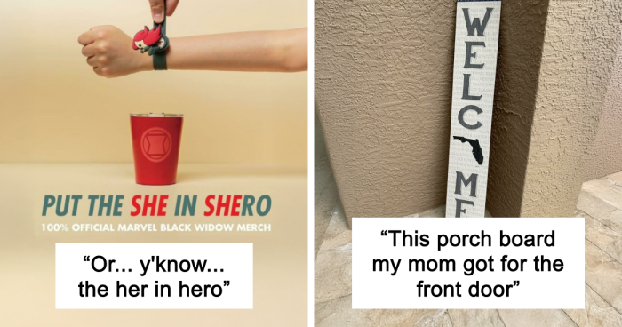
")
Think of typography like a party: if the fonts don’t mix well, things get awkward fast. Too fancy or too tiny fonts can make your eyes scream for mercy. Pro tip: pick fonts that actually look good together and let your message shine.
Because no matter how smart your words are, if people can’t read them, what’s the point?


And let’s talk about “Font Gluttony” – that’s when you toss in every font you can find, hoping for a masterpiece but getting an eye-pocalypse instead. Stick to a small font family (like 3 or 4) and keep it consistent. Your audience will thank you.
Think of your fonts like your squad – they gotta vibe well together or it’s just awkward.


Fonts have personalities, and mixing a fancy script font with a bold block one is like pairing socks with sandals. It might be a fashion statement, but usually, it just confuses everyone reading.
Choose fonts that get along, and your design will have a better chance at not hurting eyeballs.


Ever noticed letters squished like they’re trying to share a tiny elevator? Or spaced so far apart they look like strangers avoiding eye contact? That’s a big no-no in text design. Proper letter spacing (aka kerning) can make or break your readability.


Line spacing matters too! Too tight and your eyes bump into each other; too loose and your brain has to hop between lines like it’s playing hopscotch. Finding that comfy spacing is key to smooth reading.
So, next time you design, remember: give those letters and lines some breathing room!


")
")


42
0