
 then open in external browser


 and click "Open in External Browser"
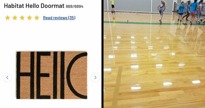
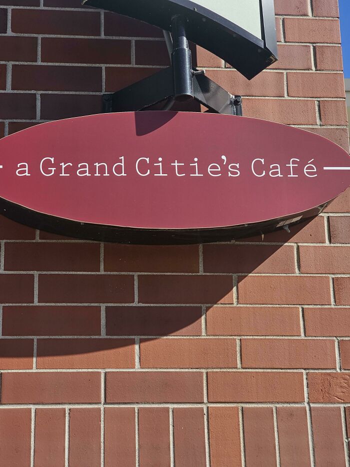
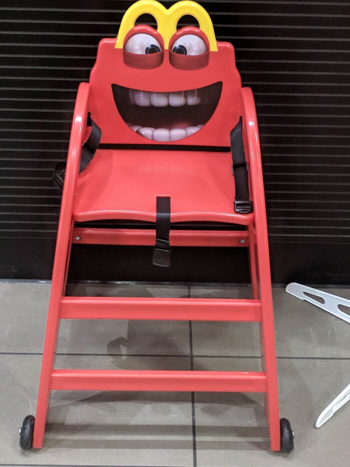
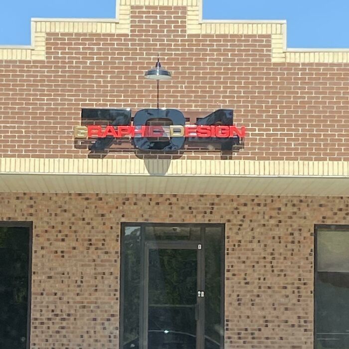
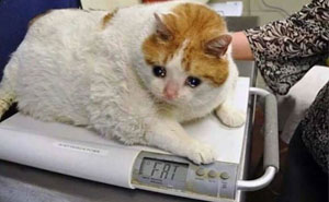
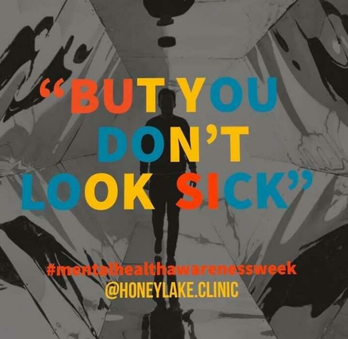
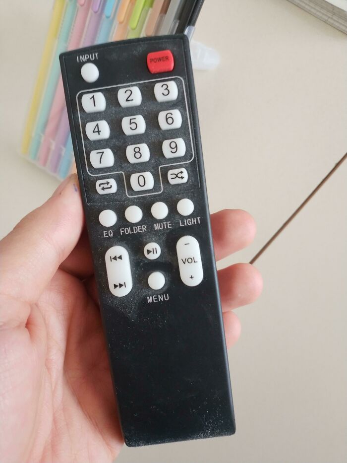
Hey there! Today we’re diving straight into some of the wildest, wackiest design fails you've probably never noticed but totally need to see. These are the kinds of mistakes that make you pause, chuckle, and wonder, "Seriously, who approved this?" Buckle up and enjoy the hilarious ride!
This post may include affiliate links.


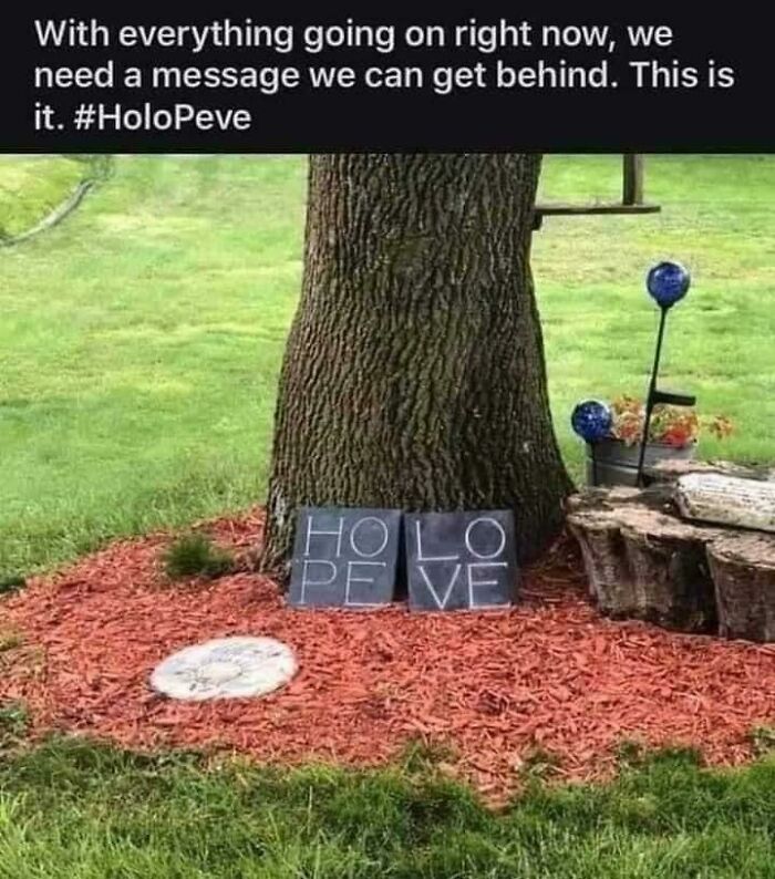

Bad design isn’t just funny because it’s wrong - it’s like watching someone trip over their own shoelaces and feeling just a tiny bit glad it wasn’t you. Psychologists (or German ones, at least) call this schadenfreude, which is a fancy word for "I’m giggling because someone else messed up." Especially when the mistake looks totally avoidable, like an upside-down door handle or a stop sign pointing straight into a brick wall. Yep, we’ve all been ‘that person’ who’s confused by a shower handle, so it’s kind of comforting to see we're not alone!
These goofy designs also poke at our sense of justice. Somewhere, someone got paid to make these things, and instead of making life easier, they made it a puzzle. Seeing those flubs online is like watching a humble pie recipe get served to the chef who burnt it. Delicious!

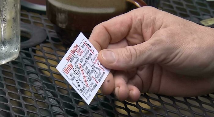

Luckily, none of this bad design hurts anybody - except maybe your patience. It’s more of a playful poke than a poke in the eye. So why do designs sometimes go so wrong? Don Norman, a design guru, thinks good designs should be so smooth you don’t even notice them. When something trips you up, it’s not you - it’s the object failing to explain itself. Like those doors you push when you should pull. Once you know the term "Norman door," you’ll spot them everywhere.

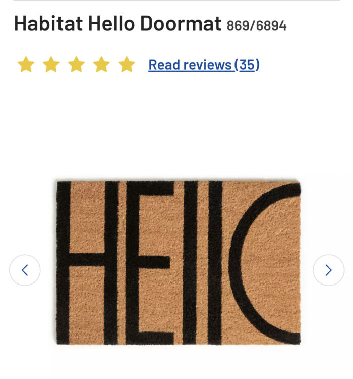
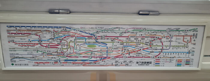
Bad design tends to ignore what people actually do and instead focuses on what designers think they should do. It hides important stuff behind fancy extras, and it’s like a ghost when it comes to feedback - you tap or click but have no clue if anything worked. Experts have a fancy list of design dos and don’ts, but let’s just say when an app asks for your birth date in three different formats, whoever made it probably didn’t follow those rules.
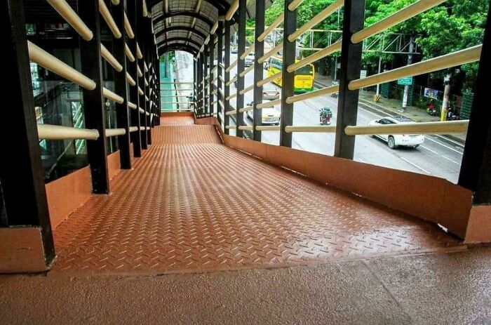

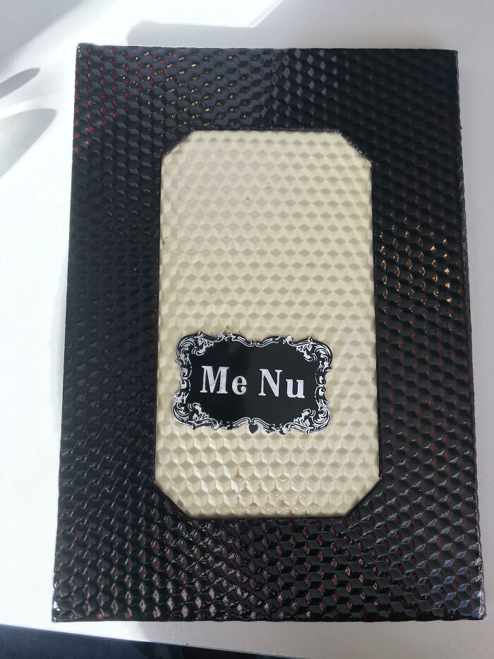
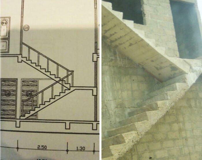
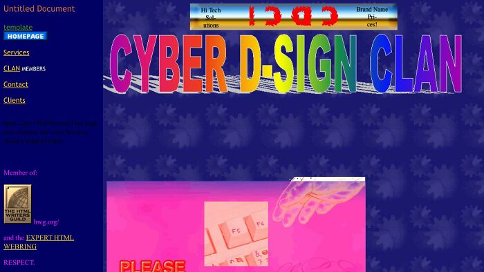
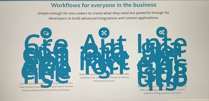
The real kicker? Most of these fails aren’t hiding in some complicated coding mess. They’re right there in your face on a signpost, a bench facing a brick wall, or a menu that’s harder to read than a handwritten grocery list. That’s why these pics spread so fast - you don't need a degree to see that something’s straight-up bonkers.

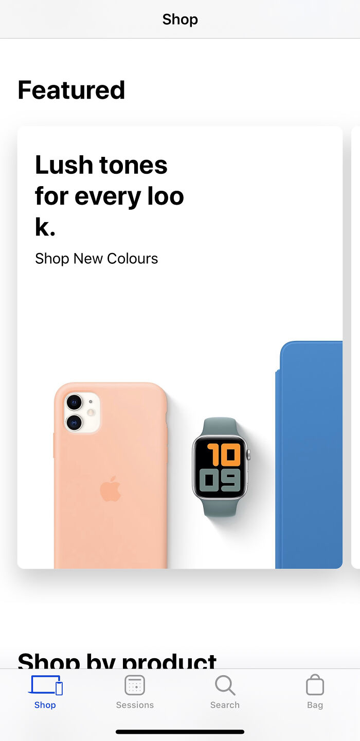
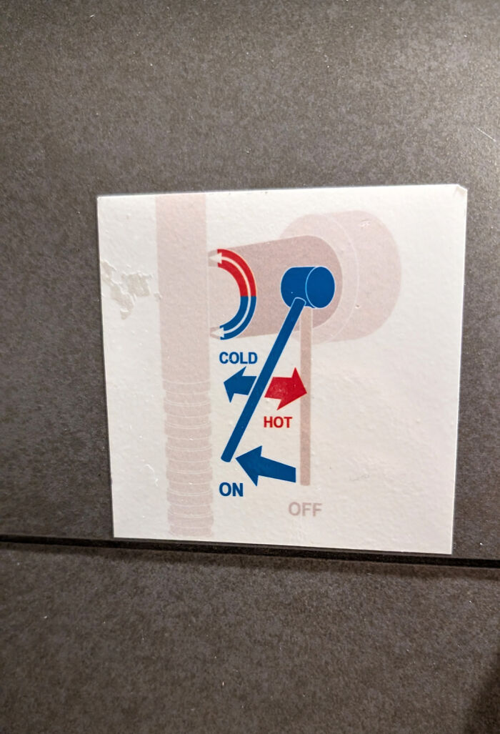
So sit back, scroll on, and enjoy these design disasters that remind us all that sometimes, creativity takes a wrong turn - and that’s just hilarious.




































48
0