
 then open in external browser


 and click "Open in External Browser"
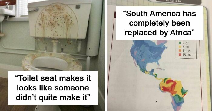
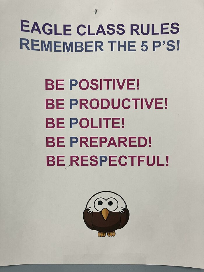
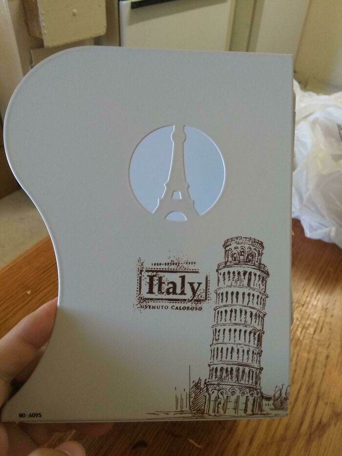
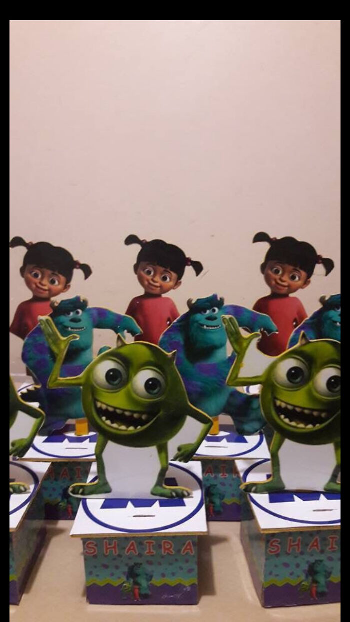
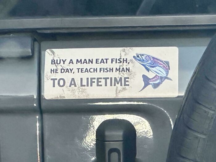
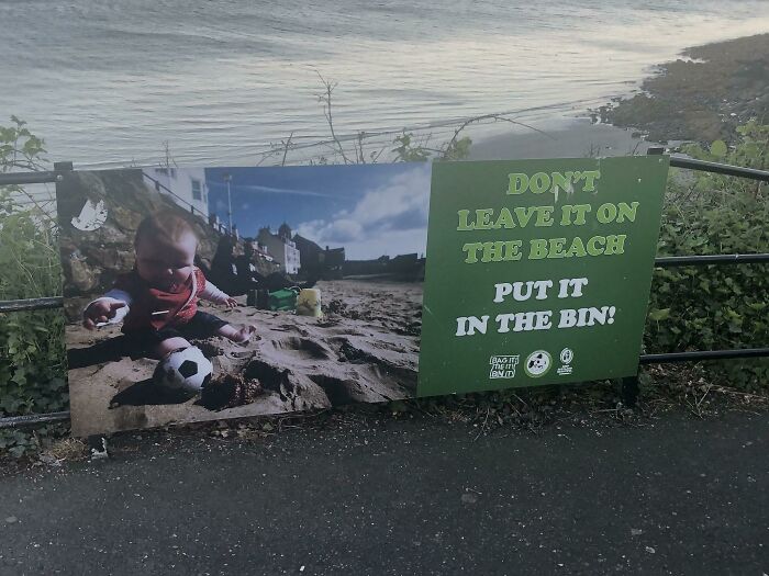
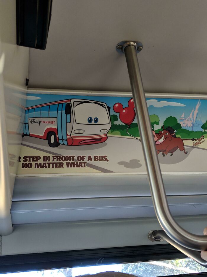
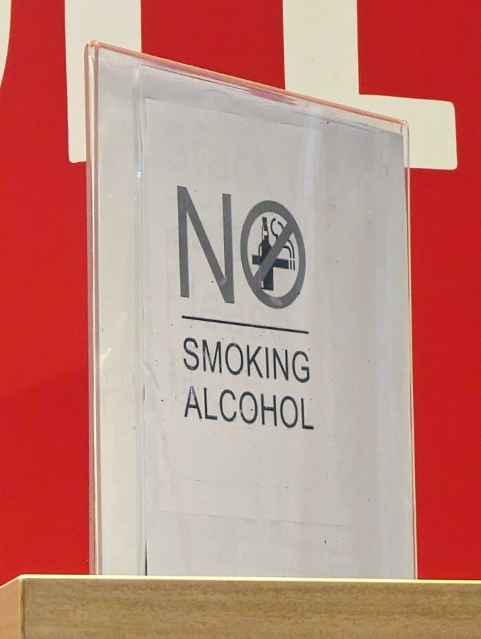
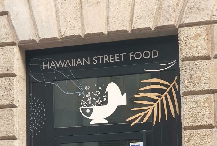
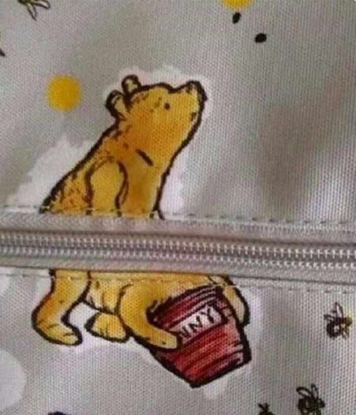
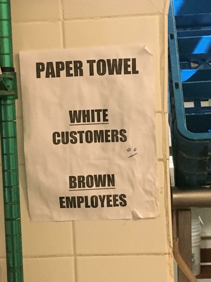
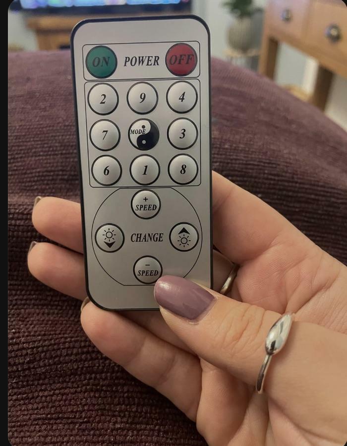
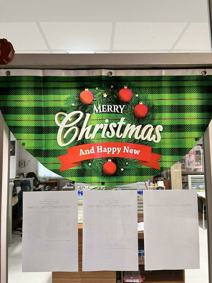
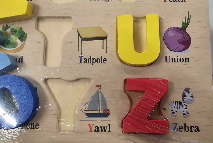
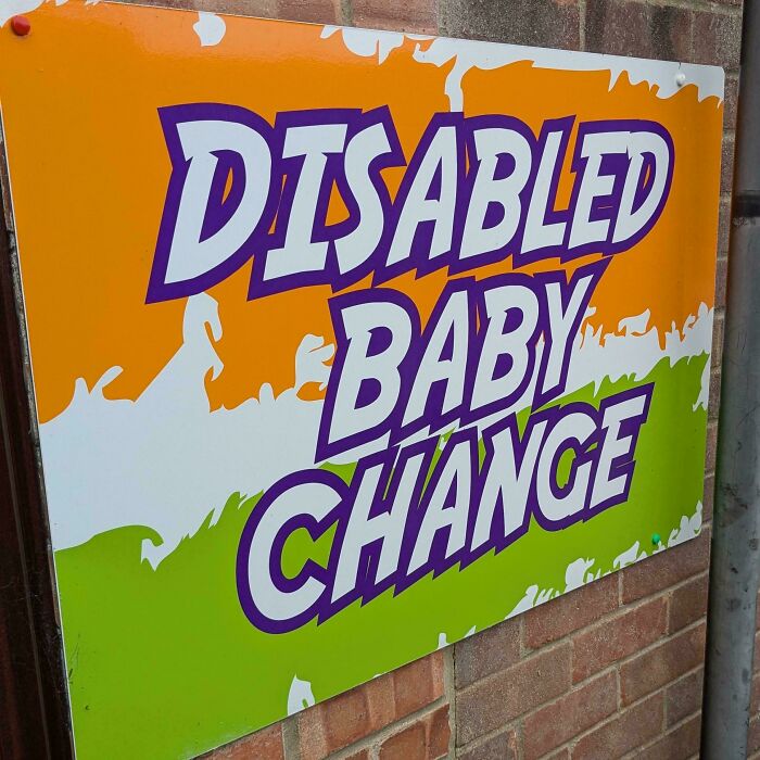
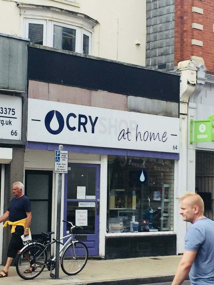
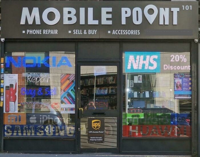
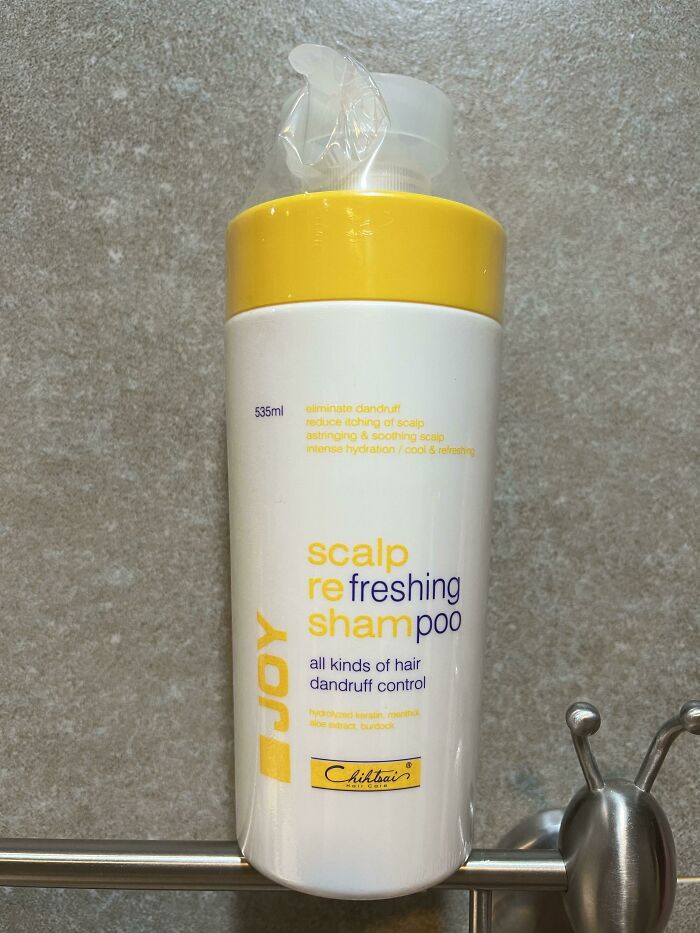
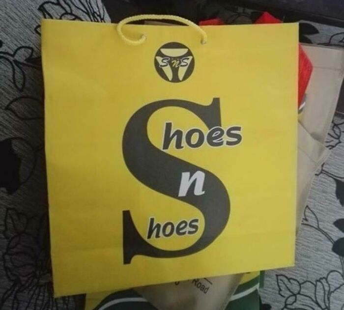
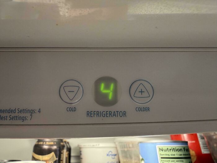
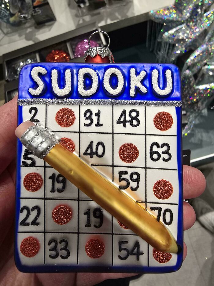
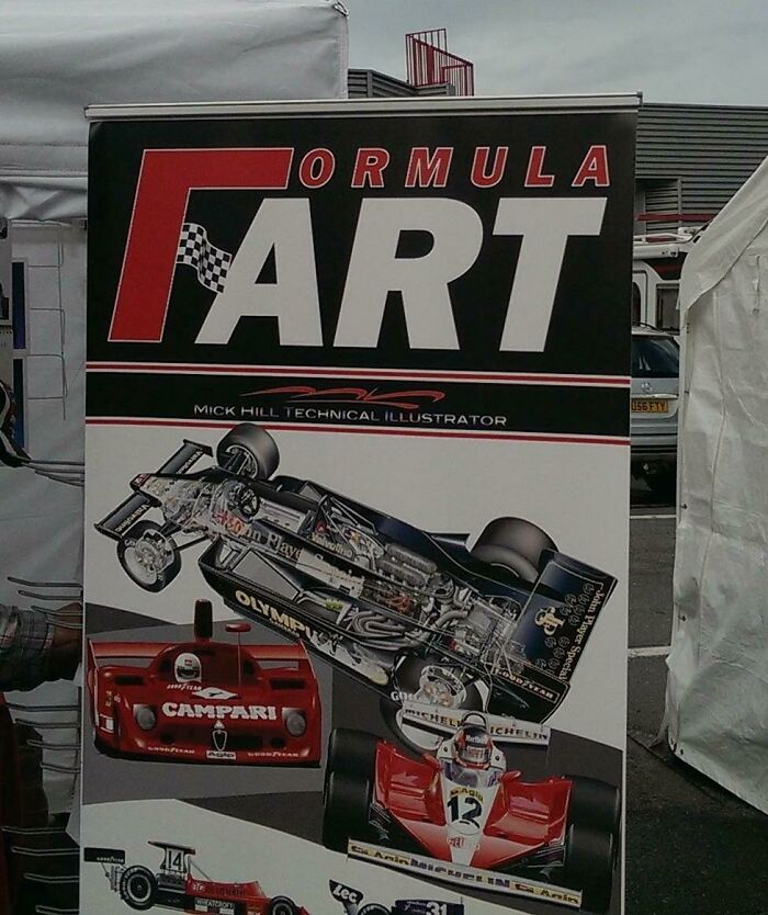
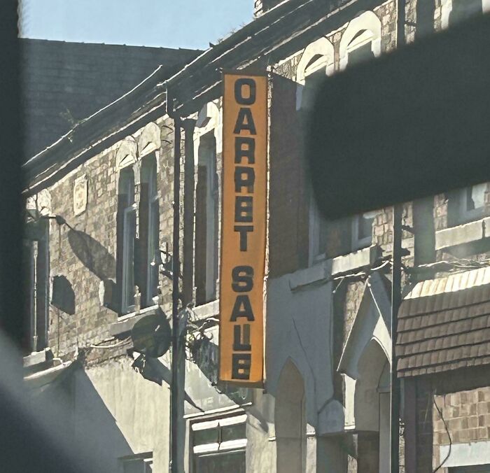
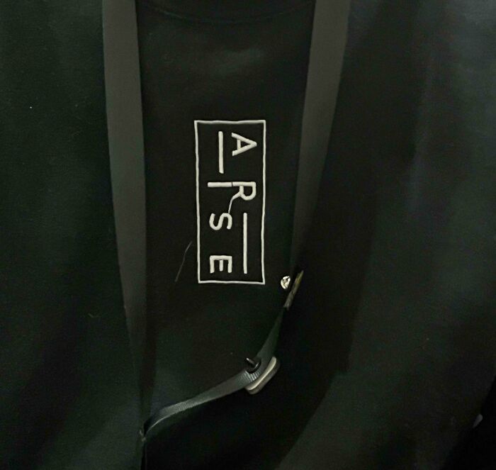
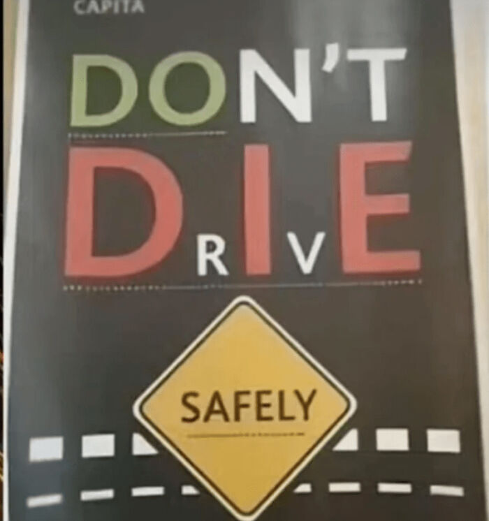
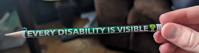
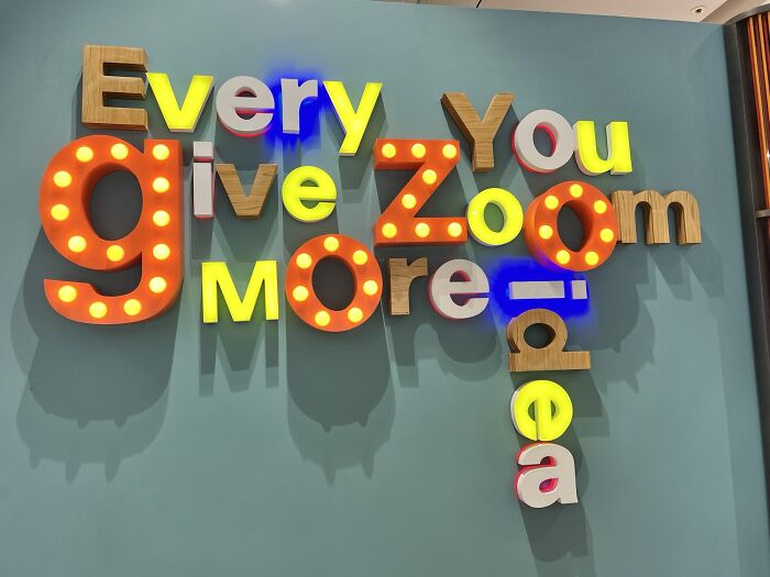
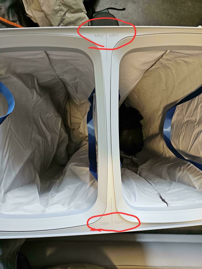
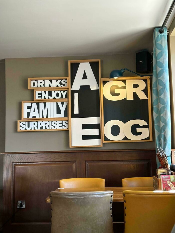
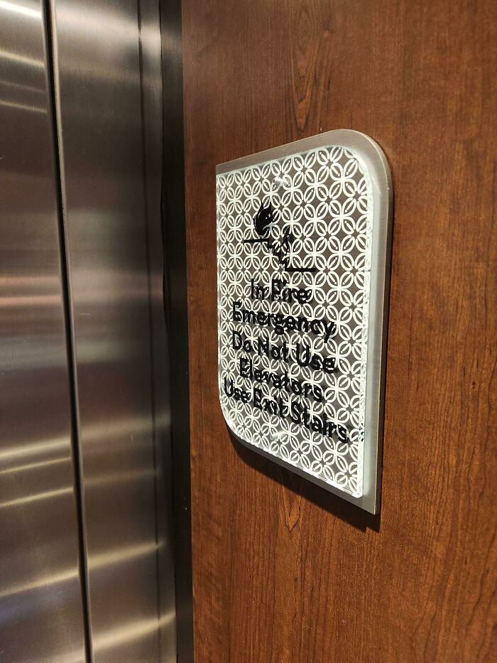
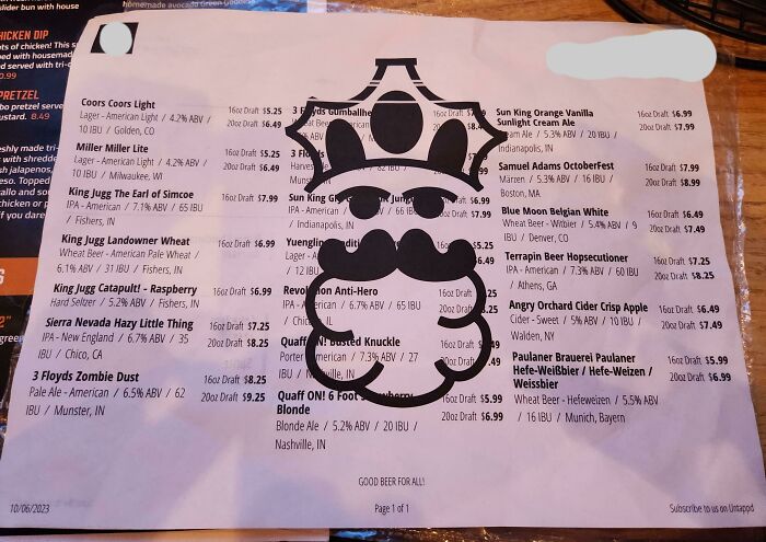
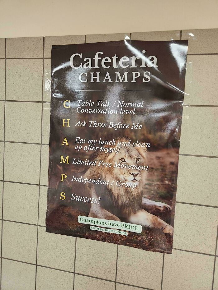
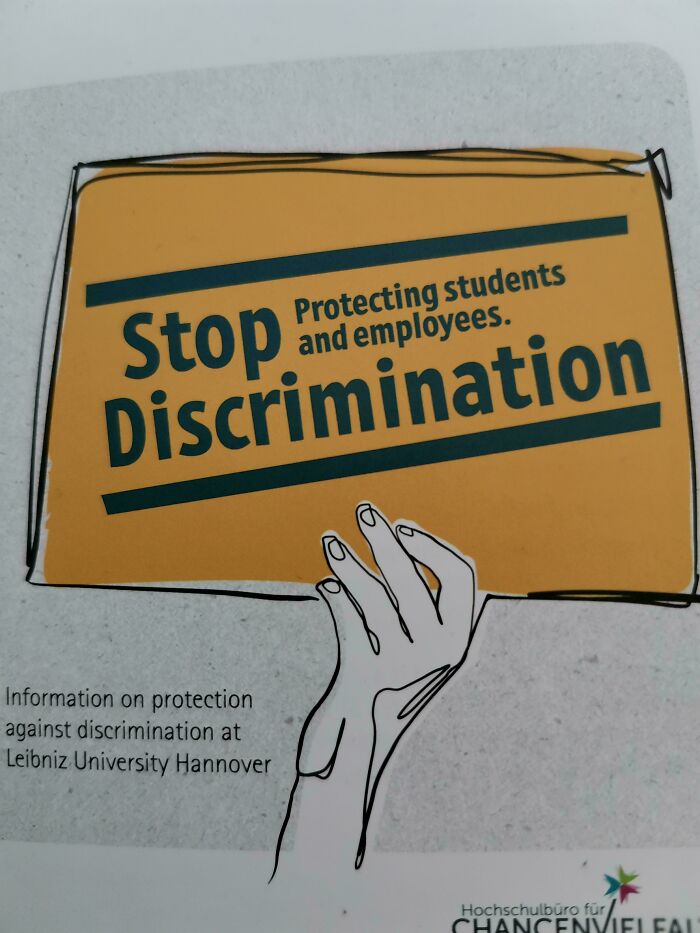
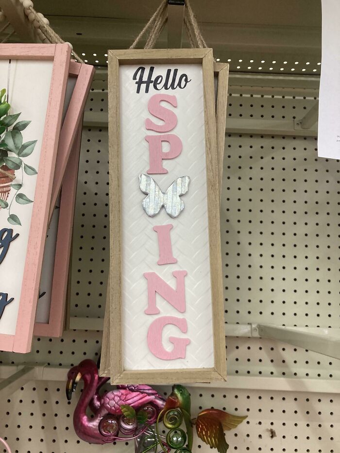
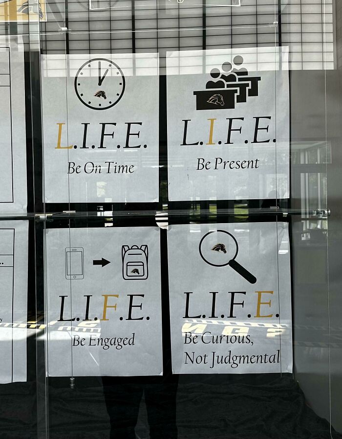
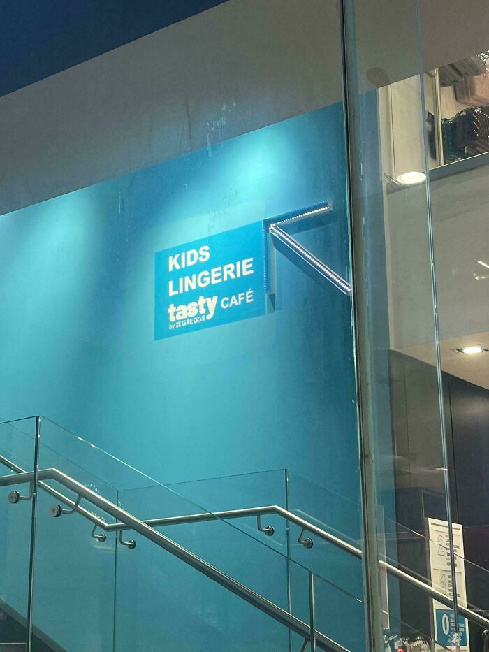
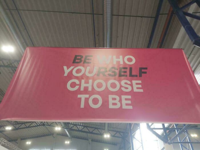
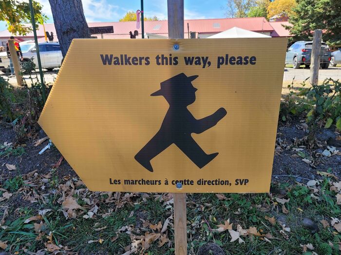
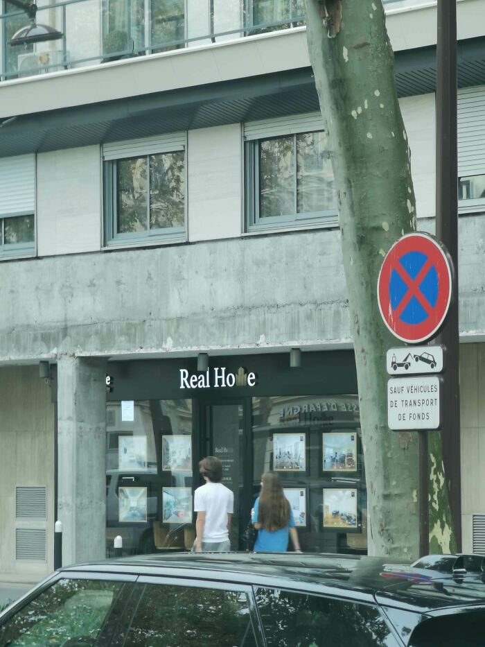
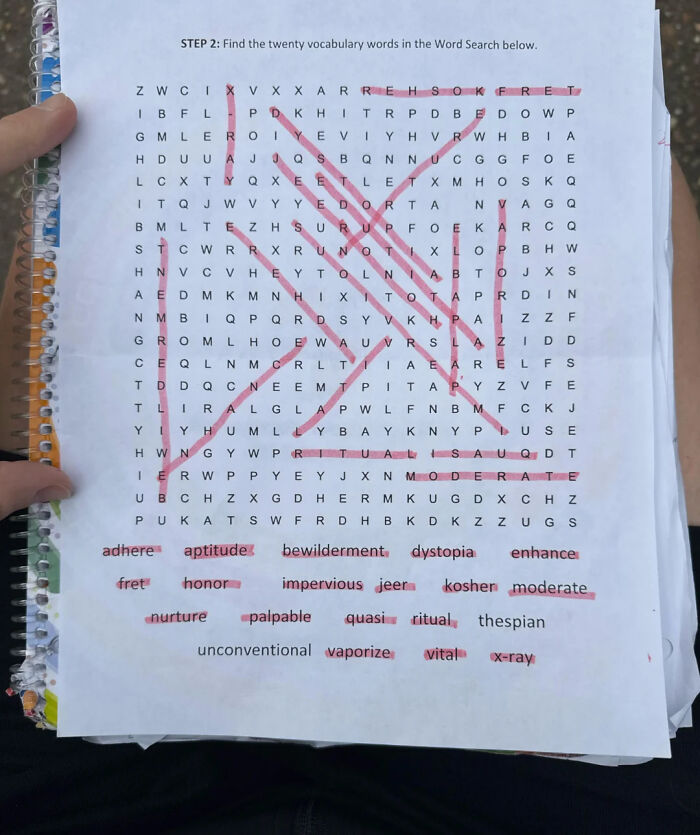
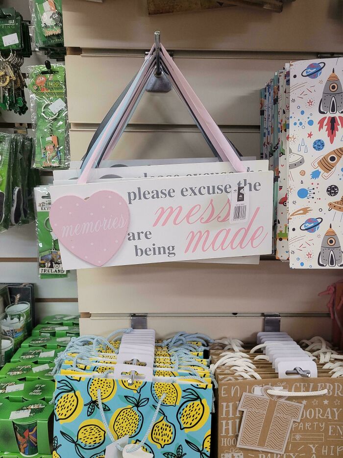
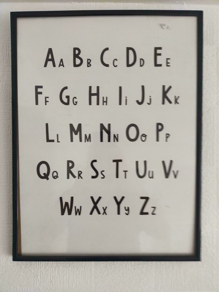
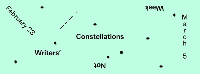
Alright, buckle up! Today we’re diving into some design blunders that make you squint, chuckle, and wonder, “Wait, seriously? Who approved this?” Get ready for a wild ride through the land of design fails that are so bad, they’re hilarious.
This post may include affiliate links.
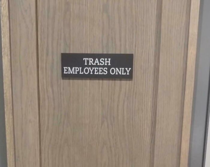

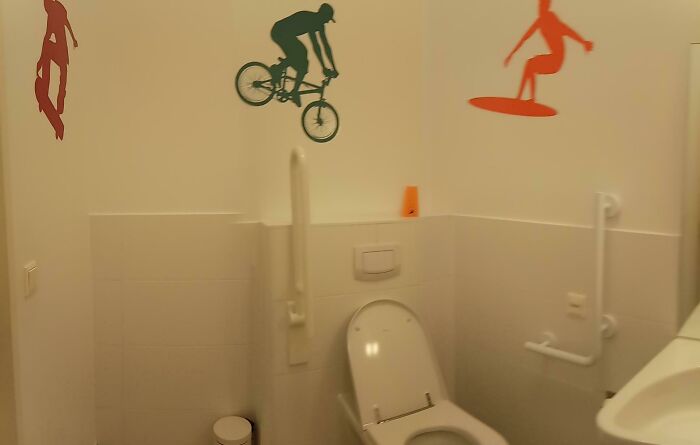
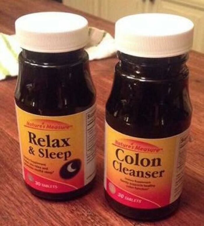
Bad design doesn’t have to be insulting to be painfully wrong. Sometimes, it's just plain confusing or boring, like Tropicana’s 2009 juice box makeover that made people drop their juice orders like hot potatoes. Turns out, messing with what people love is risky business!
Who knew a juice box could have an emotional fan club?

Then there's the GAP logo fail of 2010 - their logo got the makeover nobody wanted. The public basically yelled “take it back!” and the company did. Lesson learned: stick to what works, people!
Remember the London 2012 Olympics logo? Paid a bunch, declared “dynamic” and “cool,” but most folks just saw a weird puzzle or a grumpy piece of graffiti. Haters gonna hate, but the pros loved it. Weird flex, London.
So, what’s the moral here? Sometimes edgy design is a total miss. But hey, we love the laughs it gives us. Which fail had you shaking your head the hardest? Jump in the comments and spill the tea! And if you wanna see designers who actually nailed it, let us know - we got those too.
























38
0