
 then open in external browser


 and click "Open in External Browser"
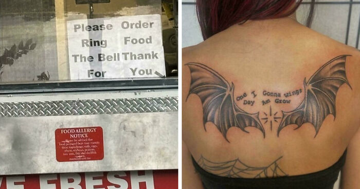
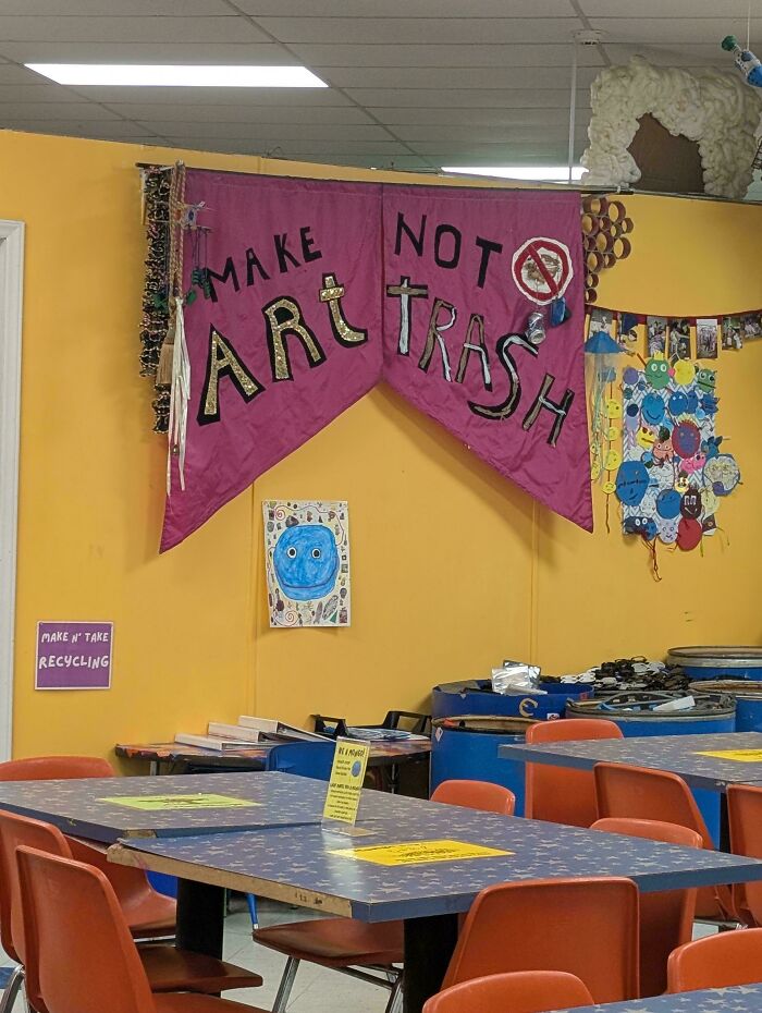
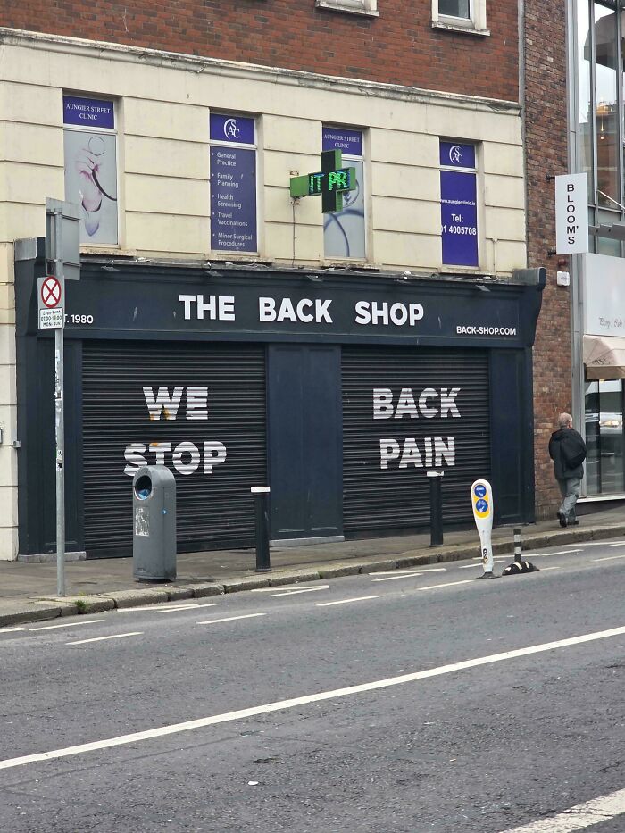
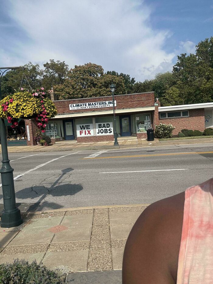
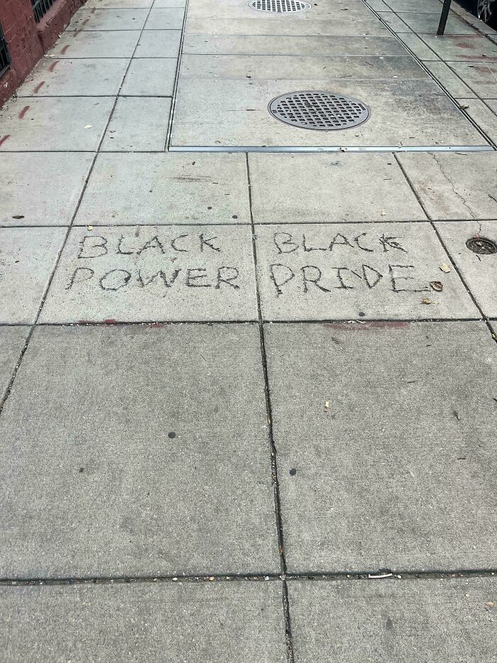
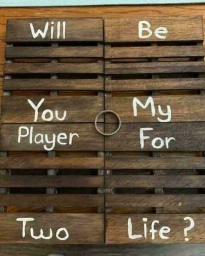
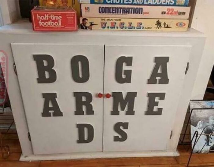
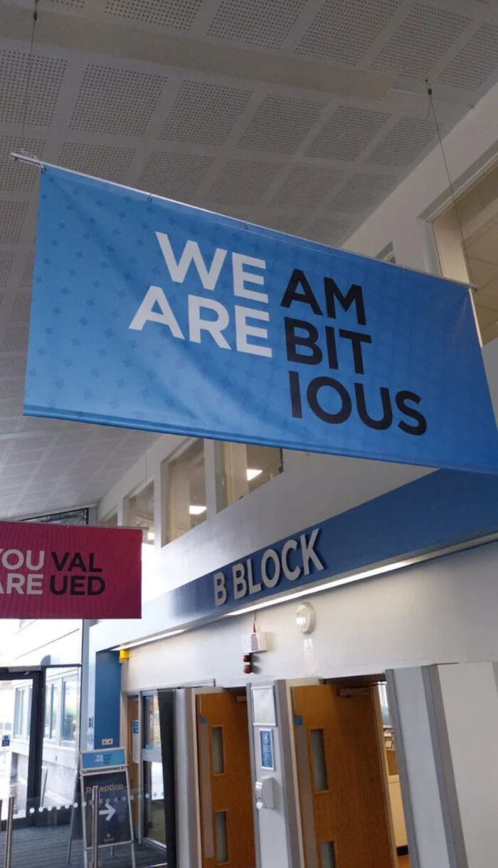
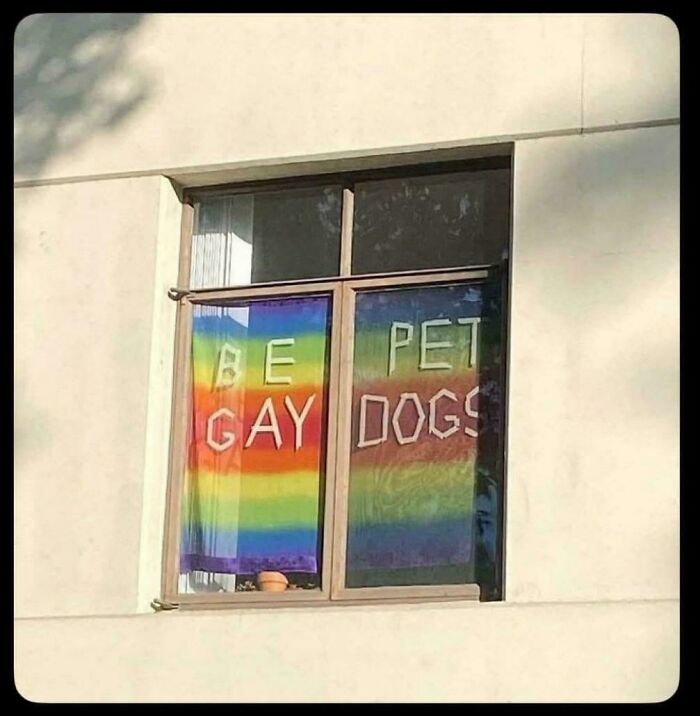
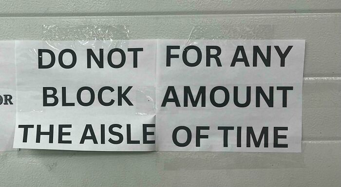
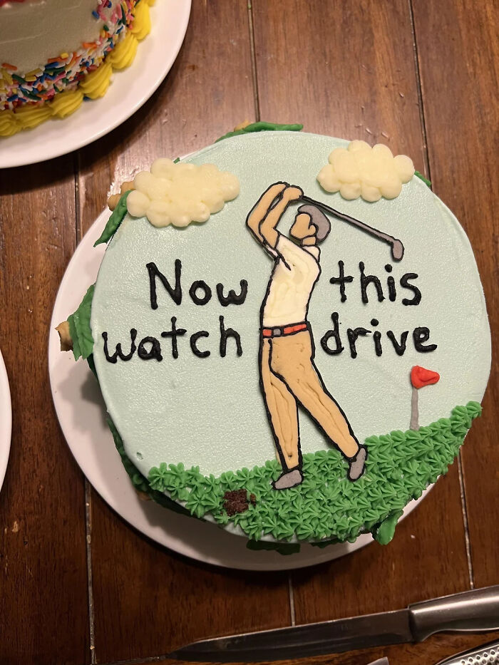
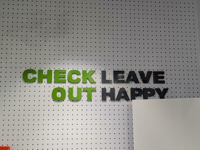
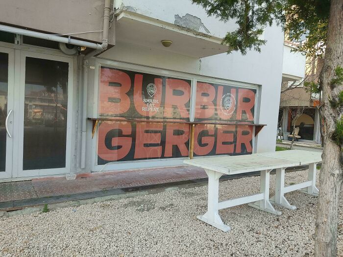
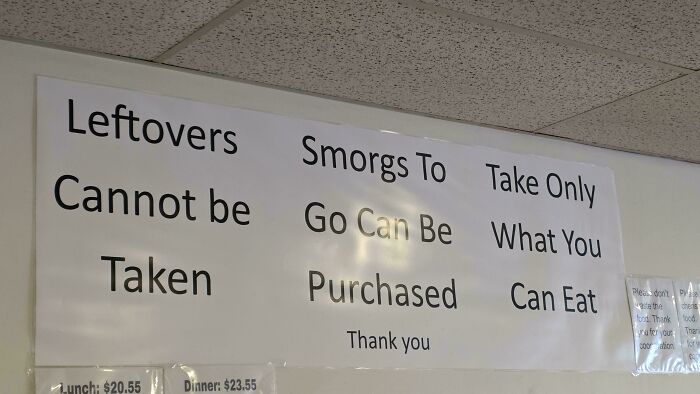
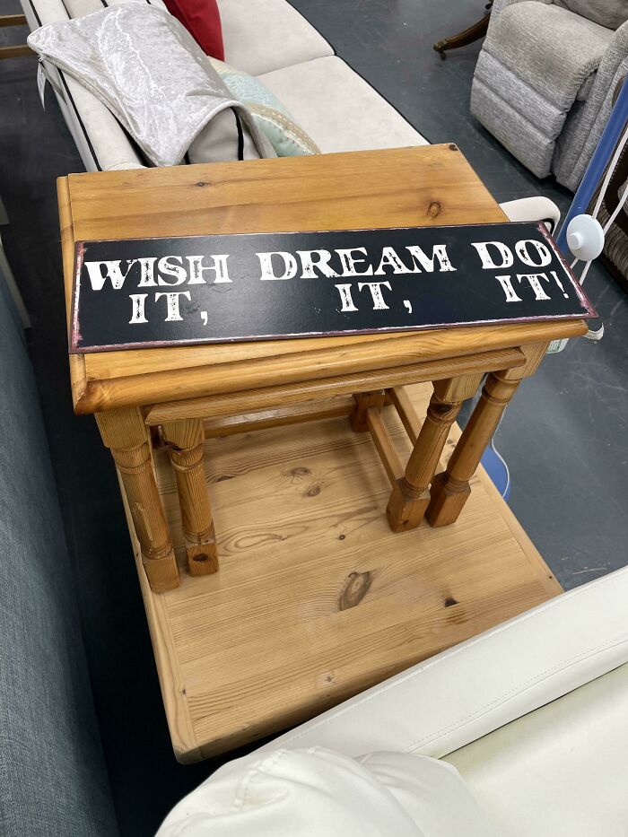
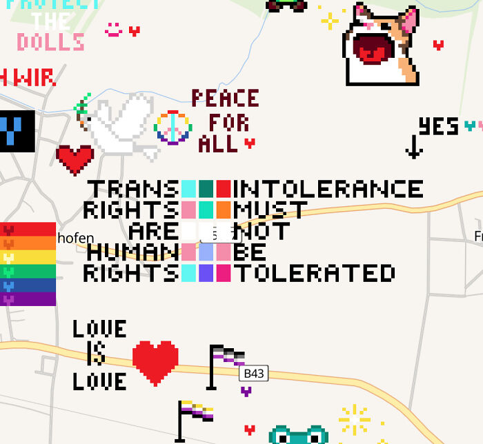
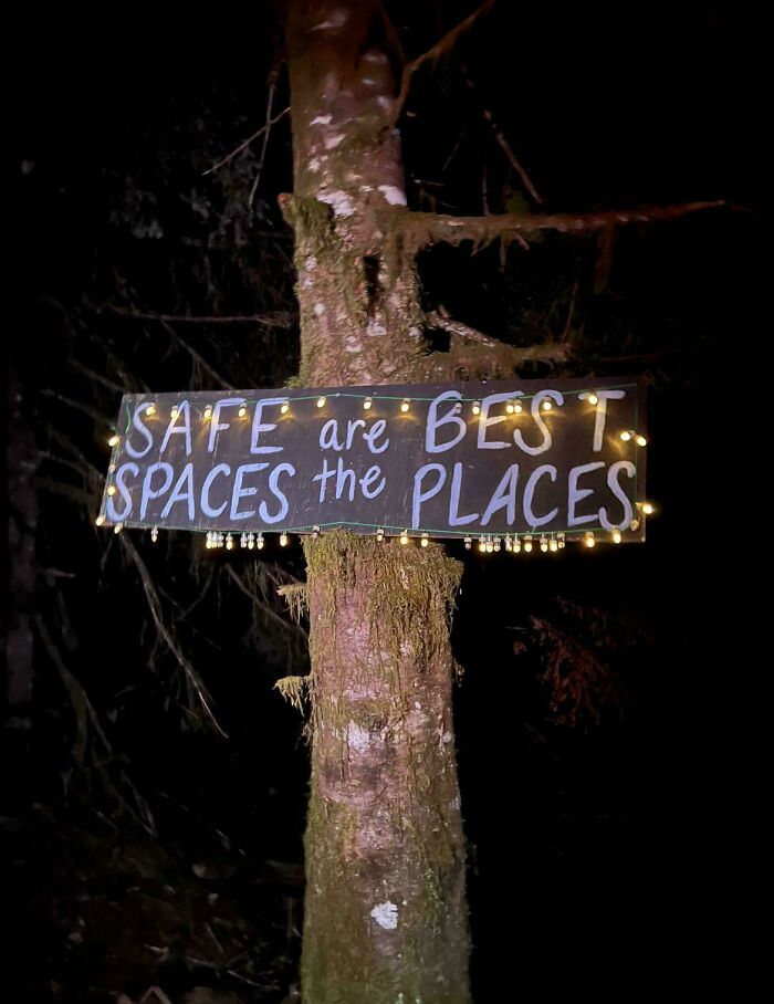
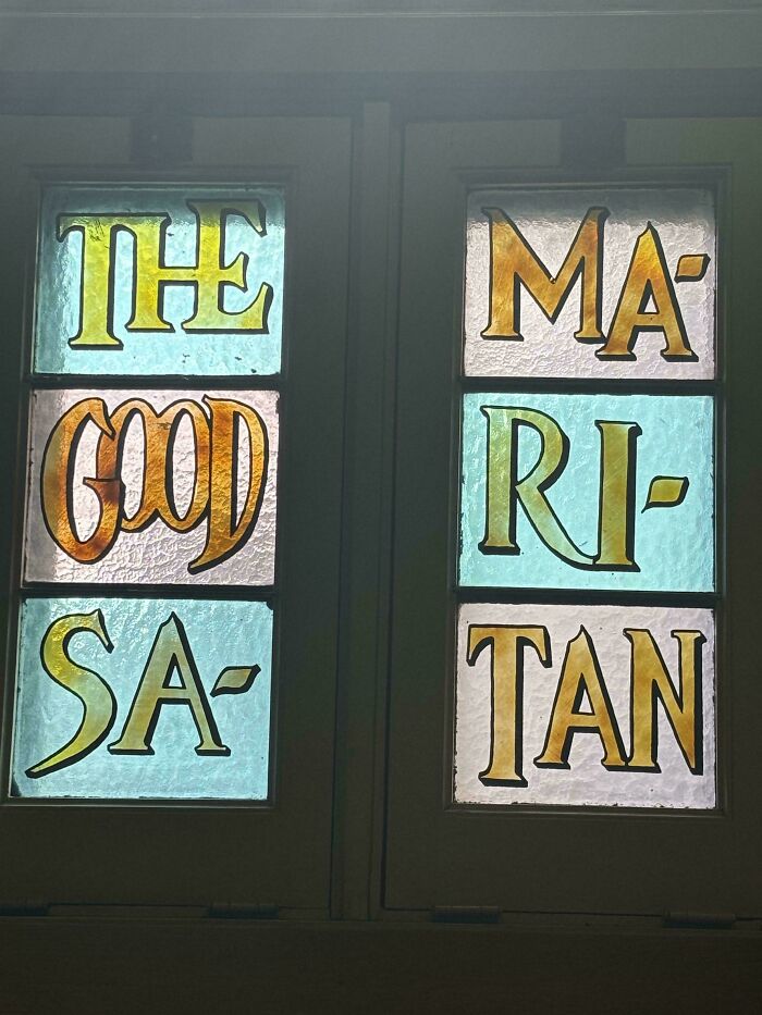
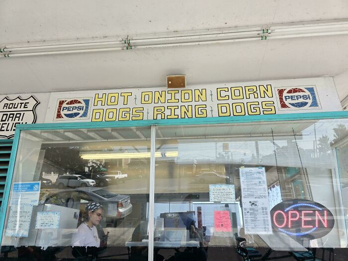
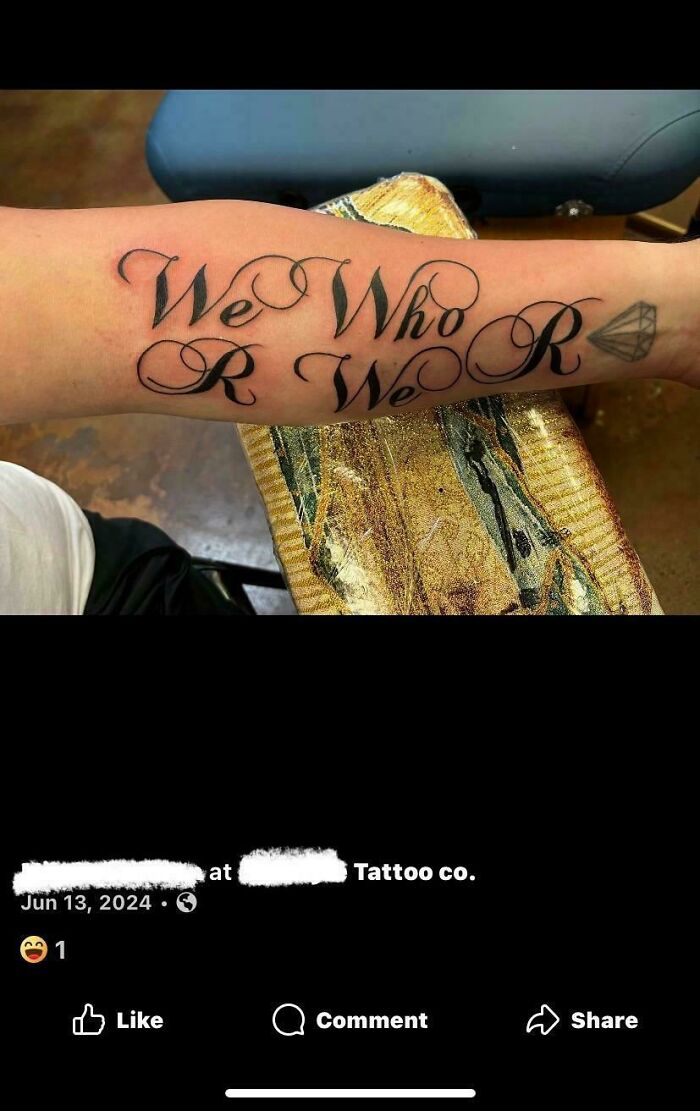
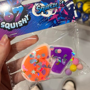
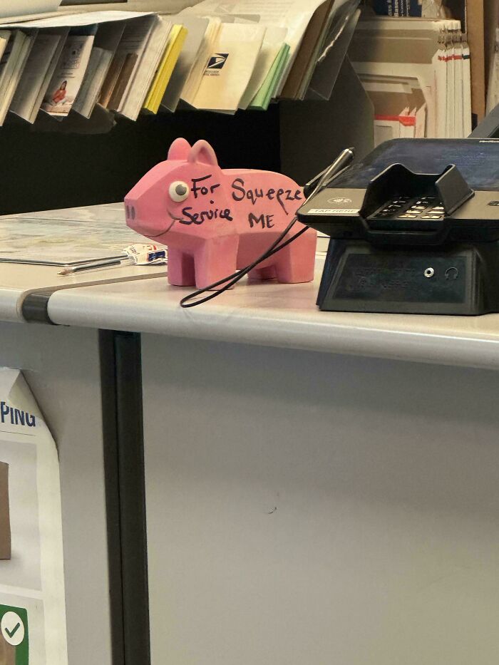
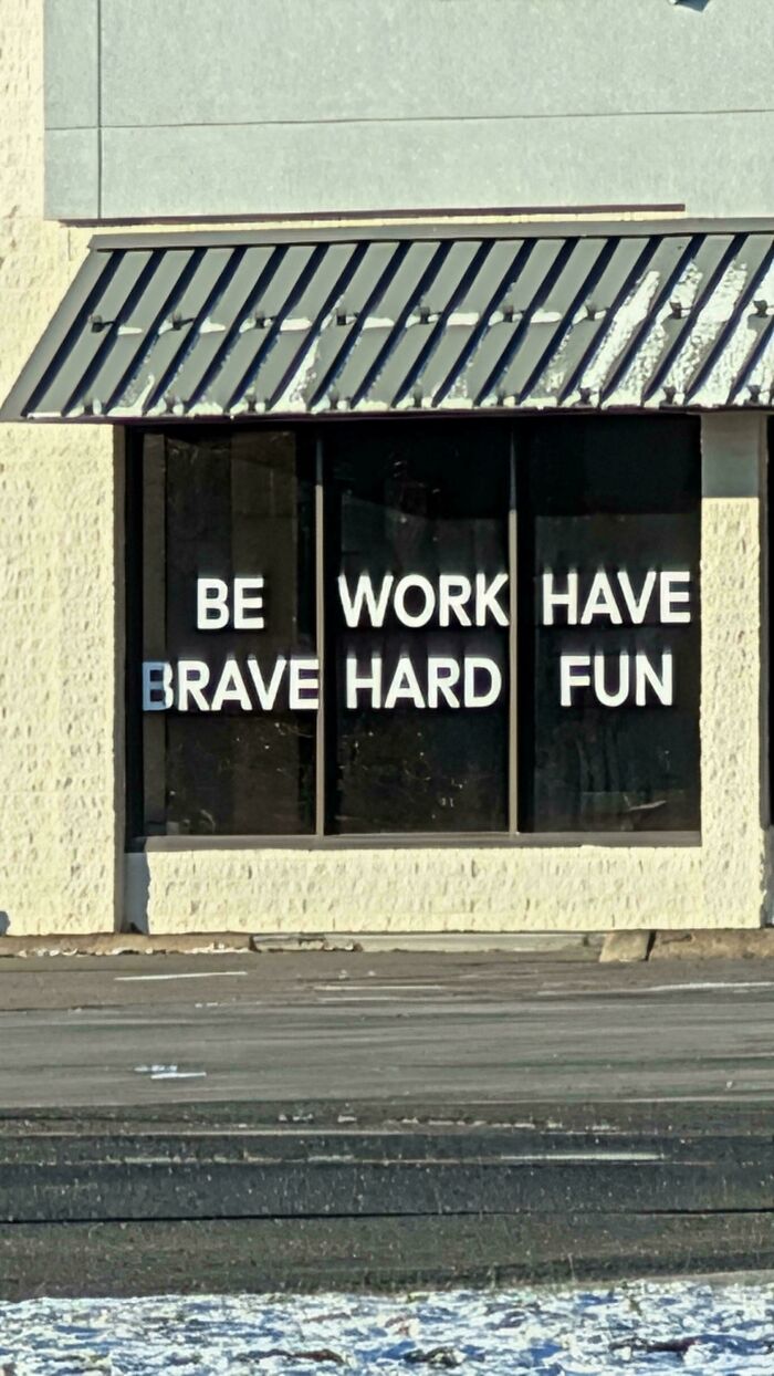
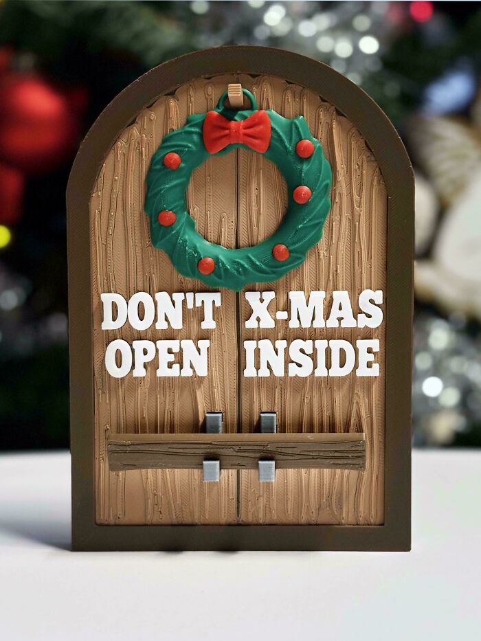
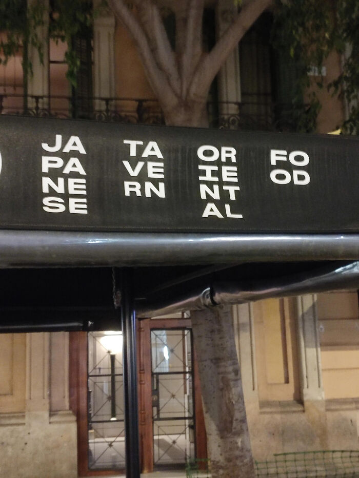
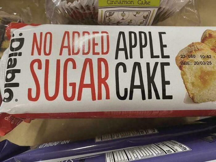
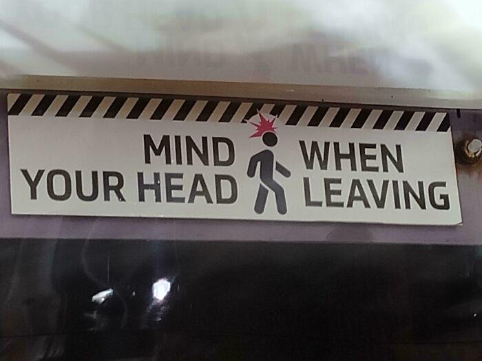
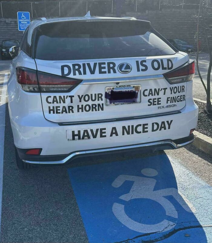
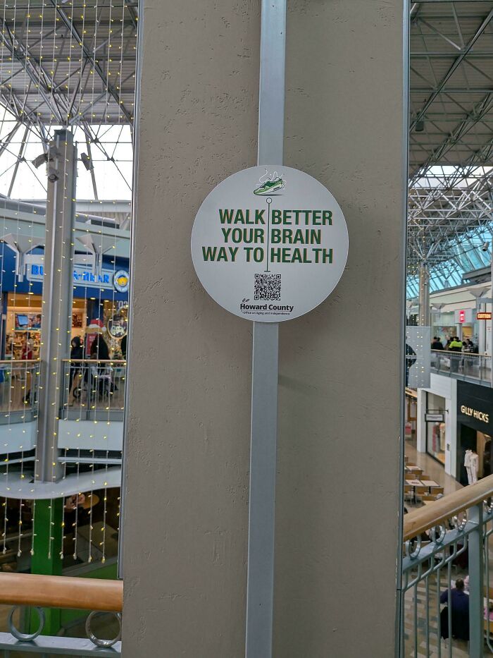
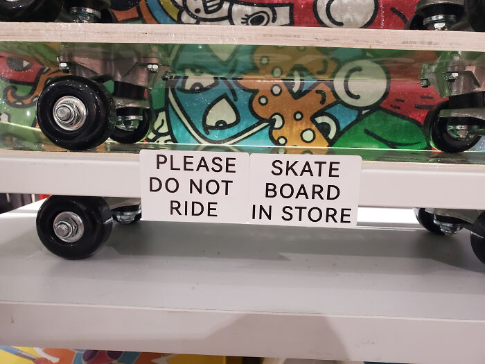
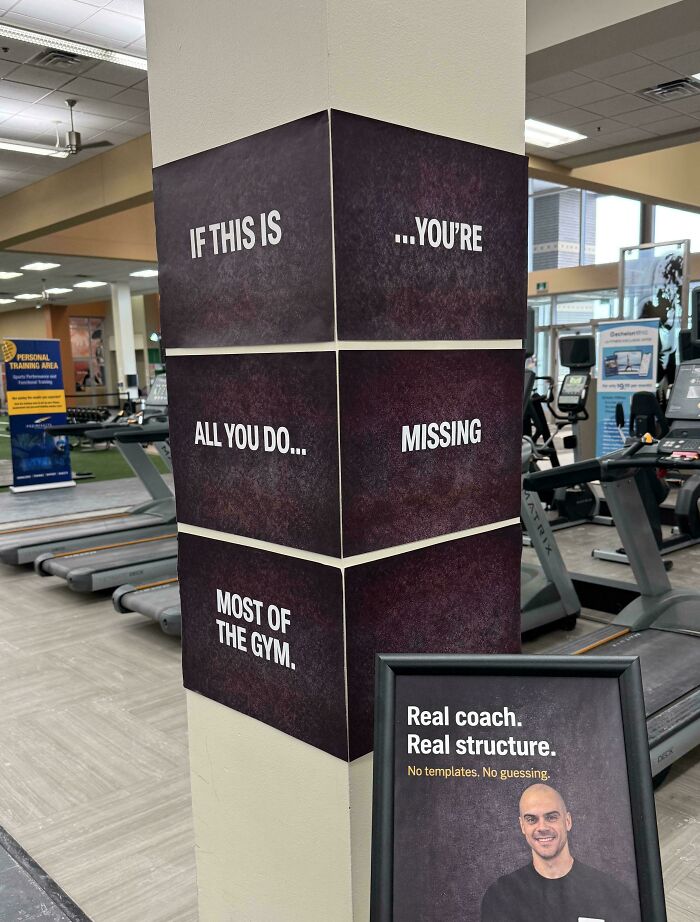
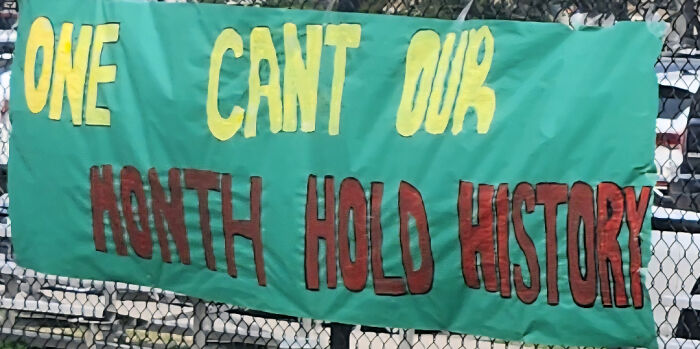
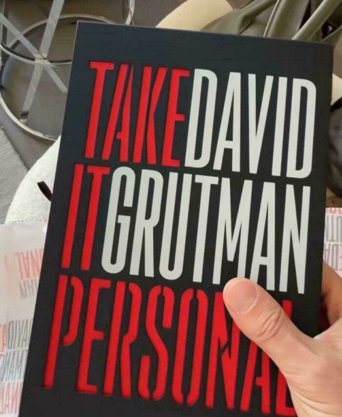
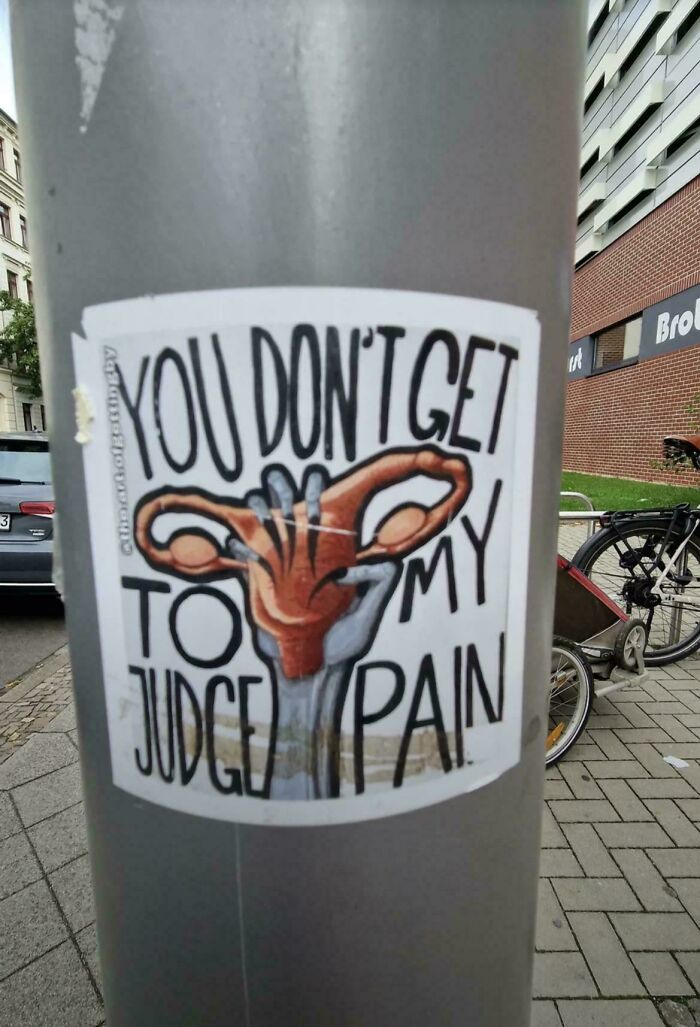
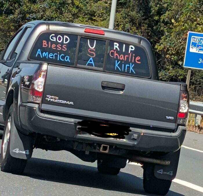
Hey! Ready to dive into some seriously goofy signs? Sometimes, people try to make a simple message, but end up creating absolute chaos instead. We found a bunch of signs that just don’t make sense when you read them the usual way. Get ready to laugh at these epic design fails!
This post may include affiliate links.
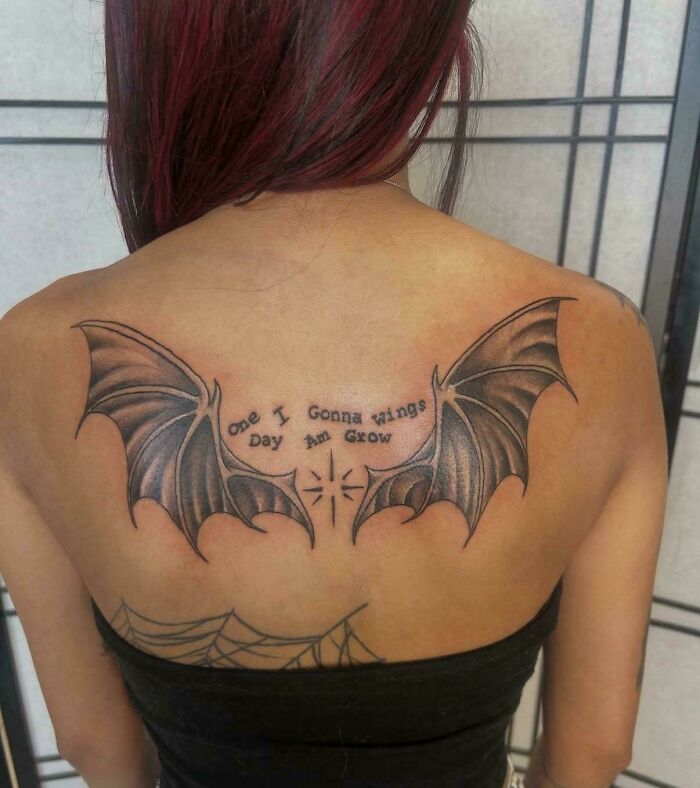

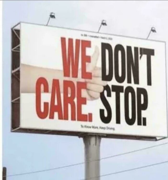

You might think you’ve got signage down just by seeing loads of signs every day. They’re everywhere - on streets, billboards, shops, even online. We’re surrounded! But making a good one? That’s another story! Clearly, these signs prove it’s trickier than it looks and a second opinion before printing is a lifesaver. Otherwise, you end up with gems like “We Don’t Care, Stop.”
Seriously, a little proofreading would have saved some embarrassment here!
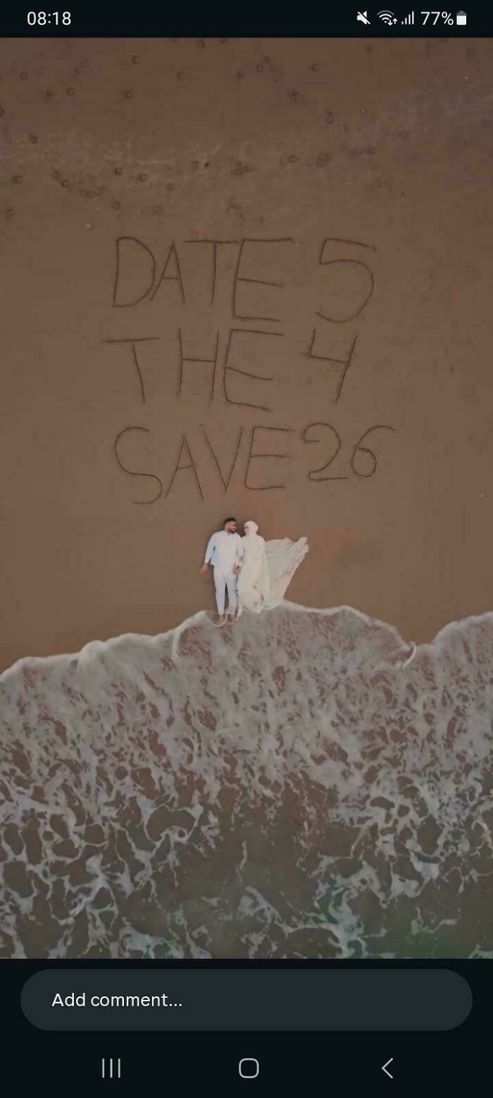

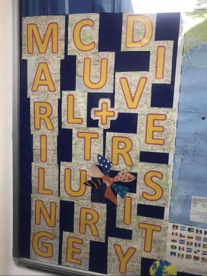
Want to avoid embarrassing sign fails? One pro tip is to figure out what kind of sign you need first. Billboards? Banners? Shopfronts? Each has its own style and rules. Do your homework! Look at plenty of examples before making a final draft.
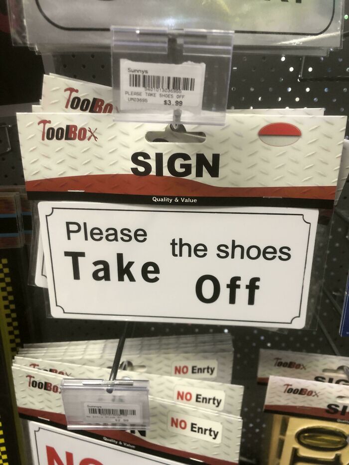
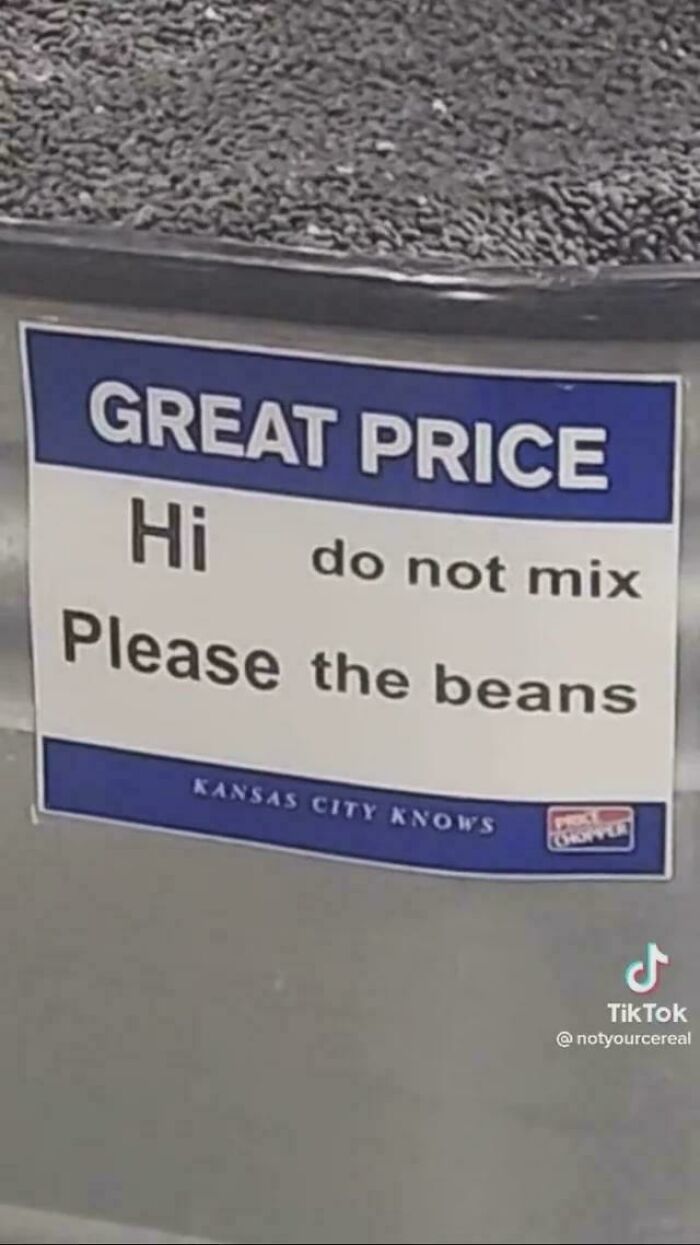

When you're doodling your masterpiece, don’t get too attached to one design. Try lots of ideas. Ask friends, family, random strangers if they get it. It’s tough hearing critiques, but way better than printing hundreds of signs that make no sense.
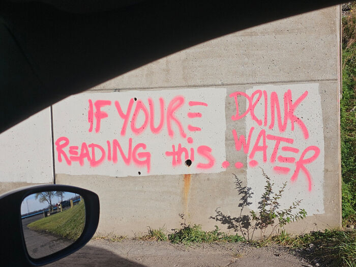

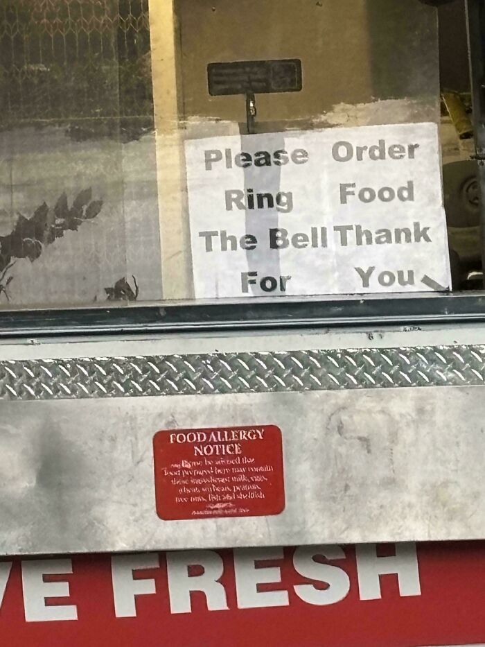
Colors, fonts, pictures - all matter big time. You want your sign to pop, but not blind people. Fonts need to be easy to read and just the right size. Keep text short and snappy so folks remember what you’re saying. Bonus points if it matches your brand vibe.

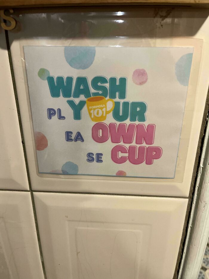
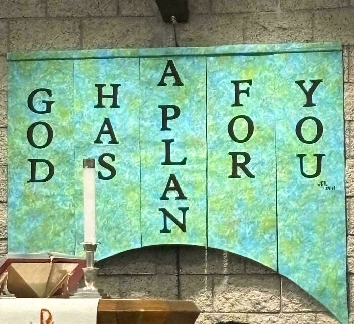
Common sign sins? Lack of contrast that turns text into camouflage, or clashing colors that hurt your eyes. Balance is key! And don’t forget the artwork. Even a cool logo can turn messy if thrown up without thought.
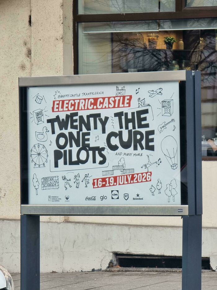

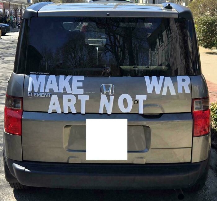
Put your sign through the test - examine it from far away AND up close. If it looks like gibberish either way, back to the drawing board! Also, make sure it fits where it will live. What works downtown might be all wrong by the beach.
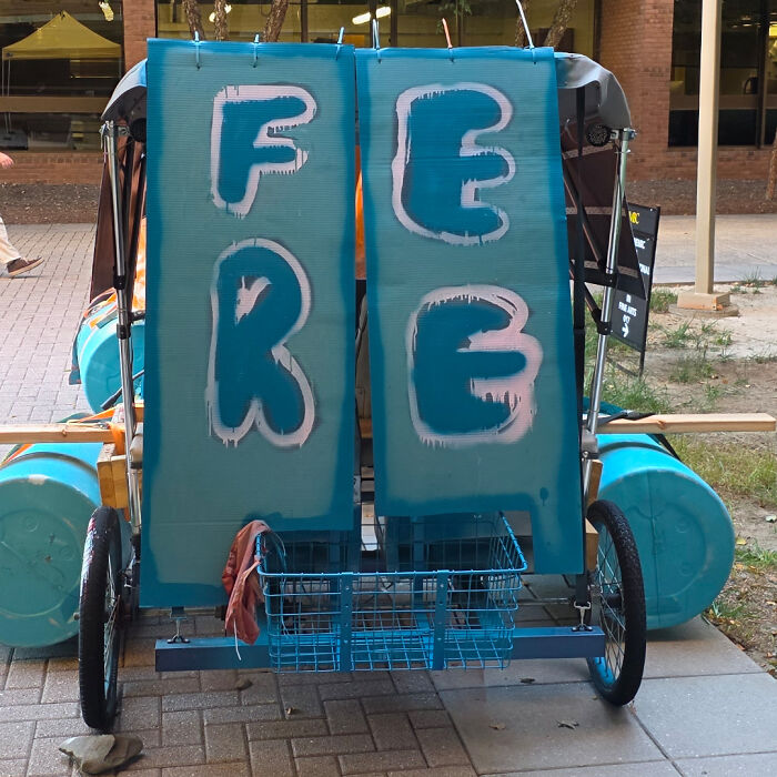
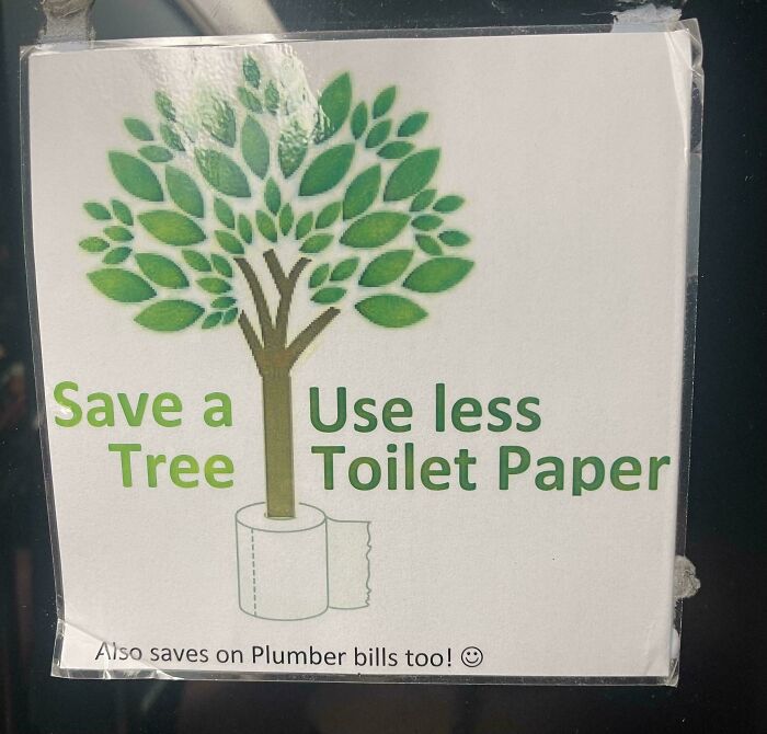

Enjoy these wild and wacky signs! Upvote your favorites that left you baffled or laughing, and share your own nightmare sign stories below. If you want even more sign chaos, we’ve got plenty where this came from.
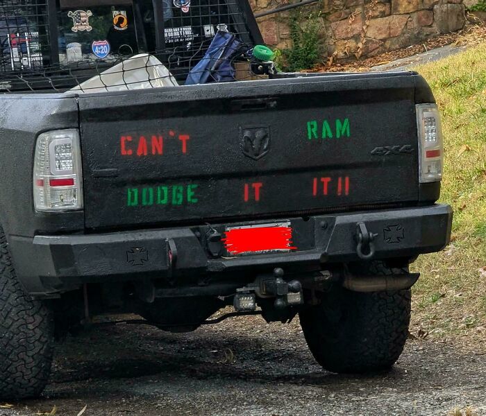

































33
0