
 then open in external browser



 and click "Open in External Browser"

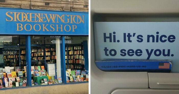
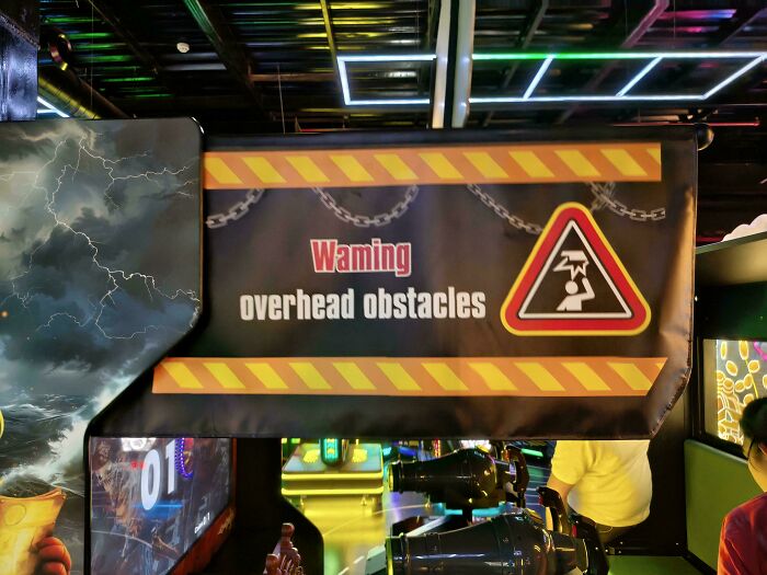
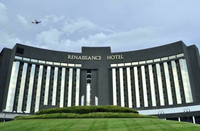
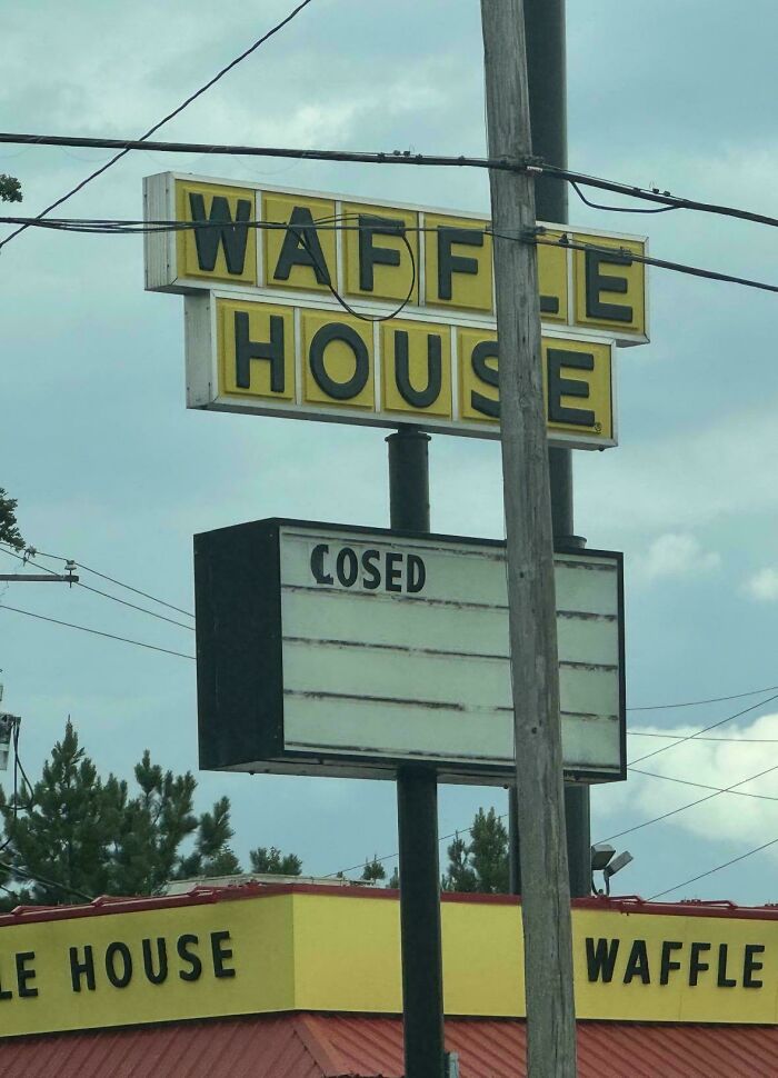
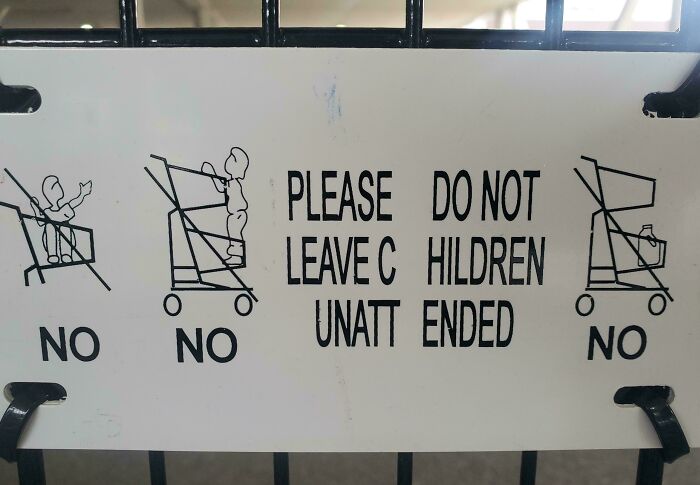
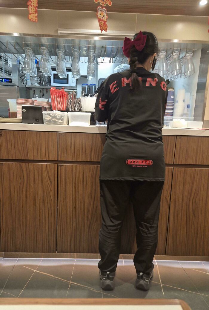
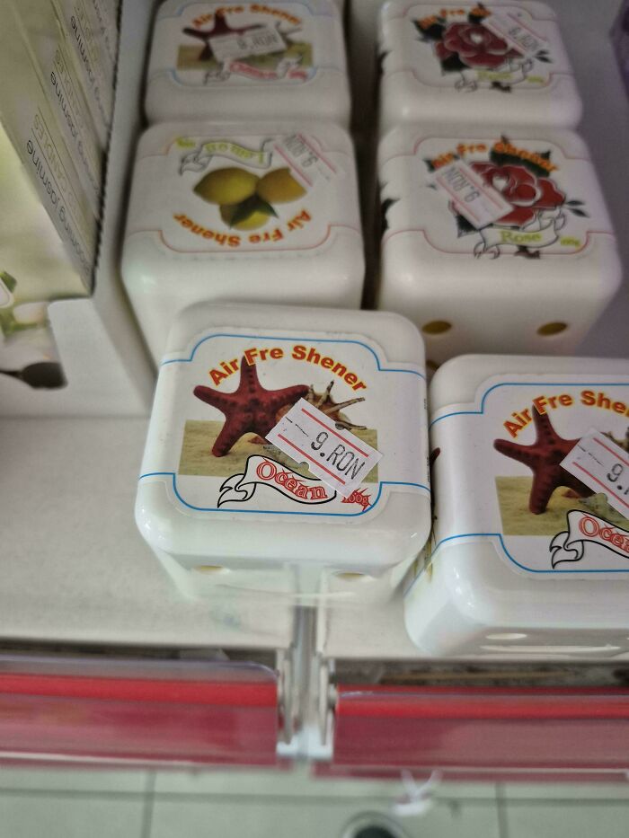
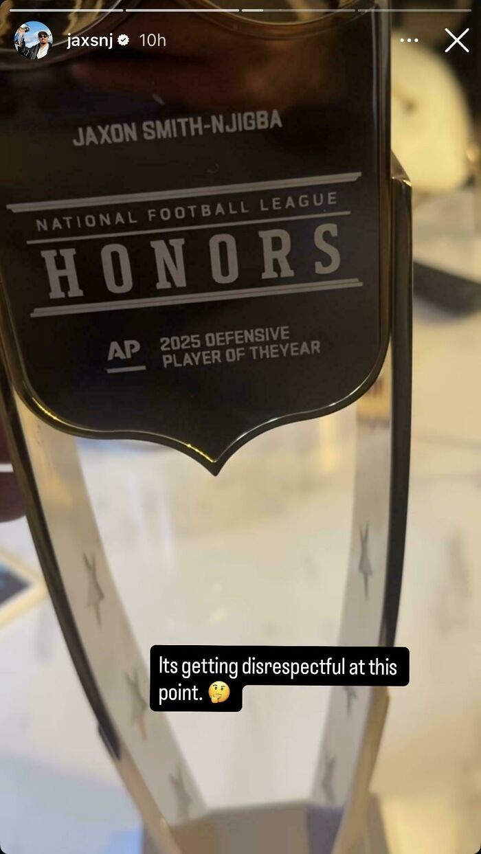
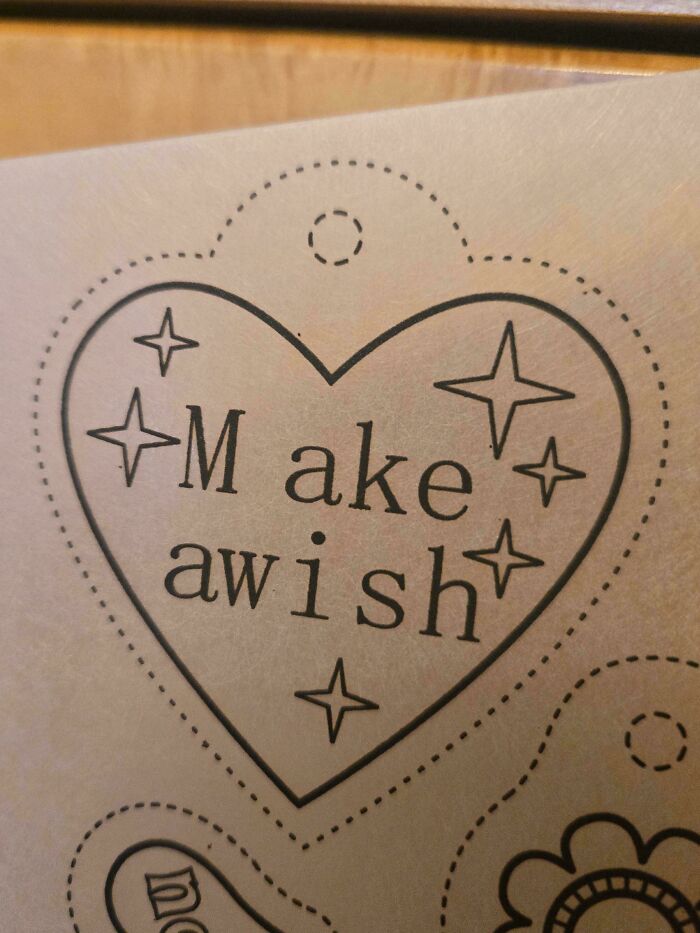
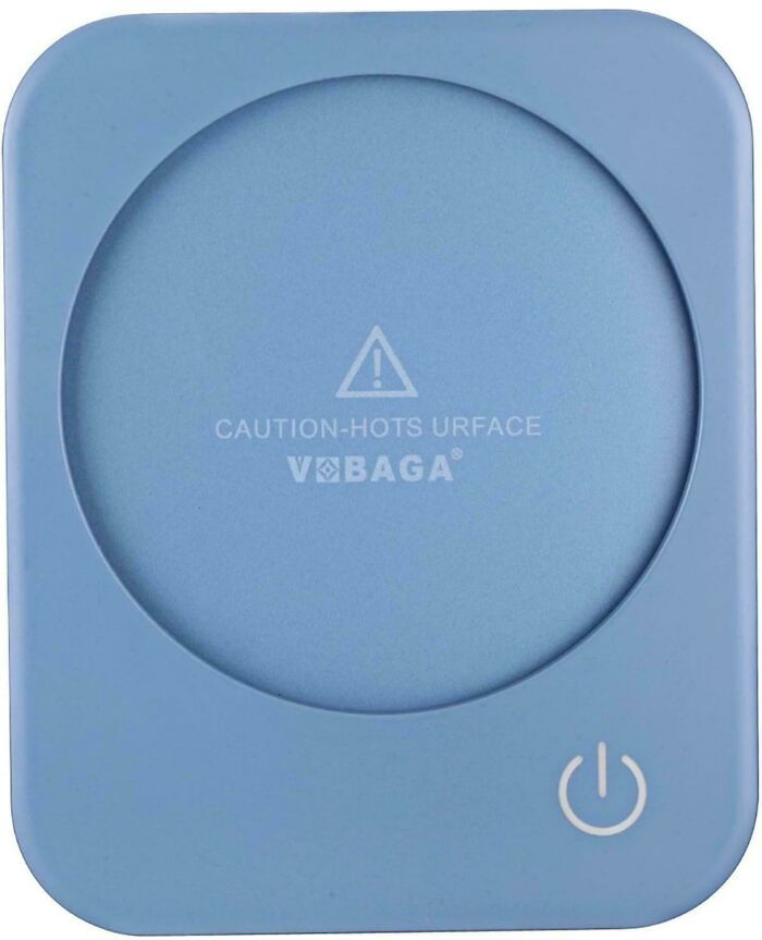
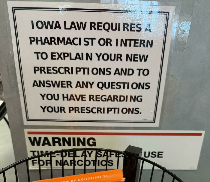
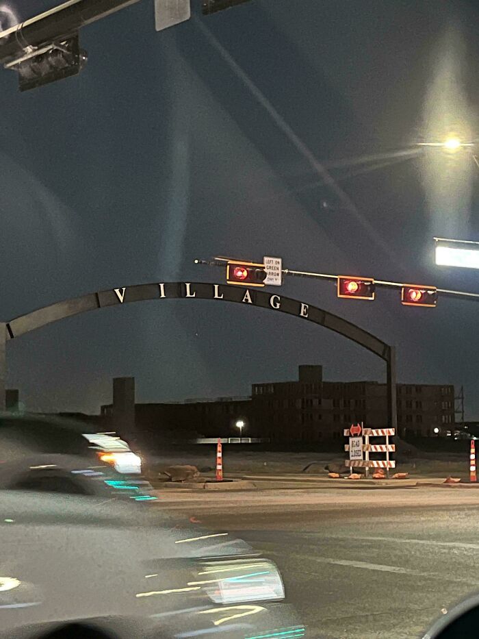
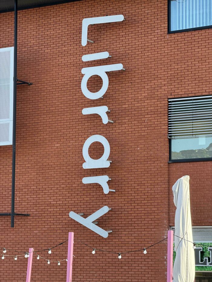
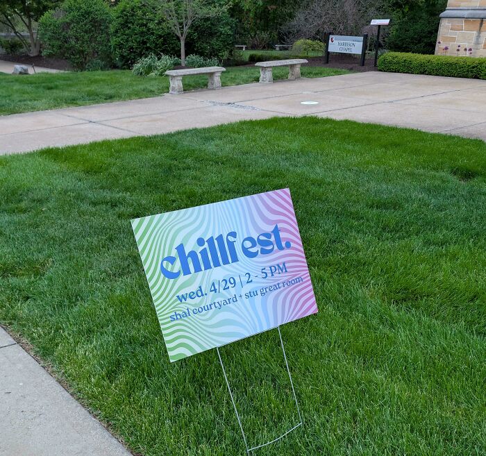
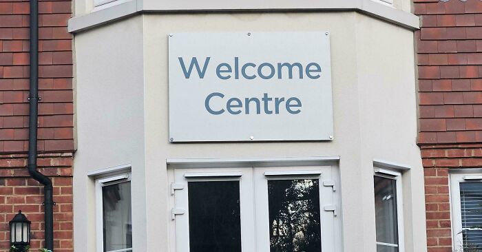
Today, we're diving into the quirky world of kerning – that's just fancy talk for the space between letters. Believe it or not, tiny gaps (or no gaps) can turn a simple sign into a hilarious hot mess.
From little lettering goofs that accidentally say the wildest things, we've gathered some of the funniest spacing fails around. Get ready to giggle and squint as you scroll!
This post may include affiliate links.
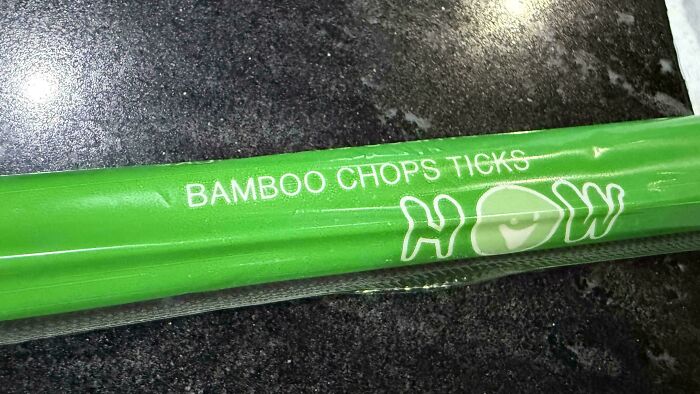

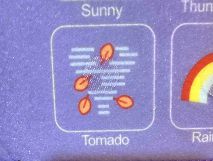
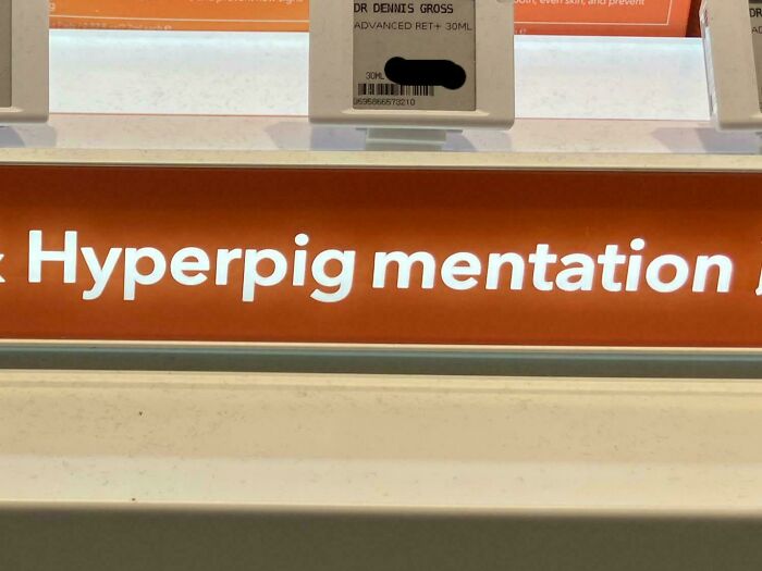
First off, what even is “kerning”? If you squish an "r" and an "n" together, they can look like an "m". So kerning is about getting that letter-spacing just right, or else you end up with words that read like a secret code.

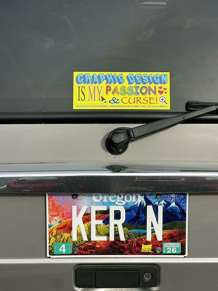
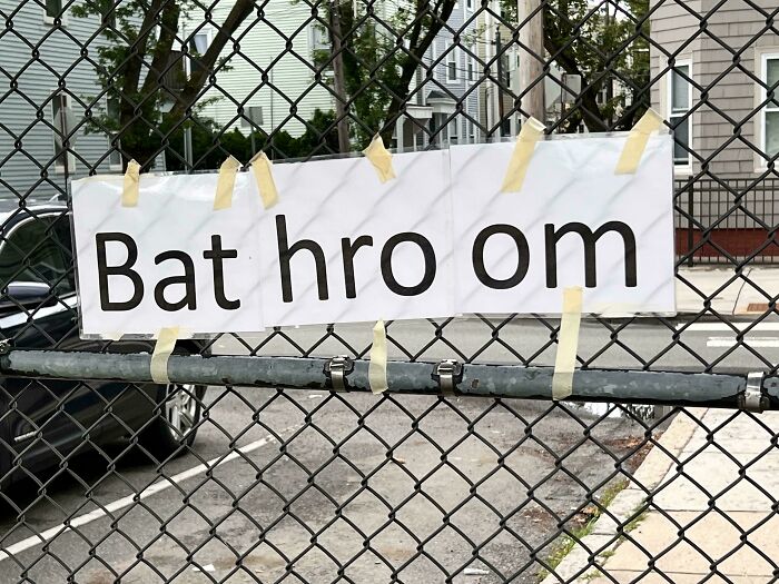
The word “kerning” comes from some old-school printing talk - it originally meant parts of letters sticking out so characters could nestle together nicely.
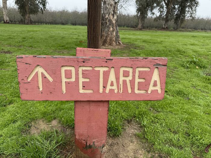
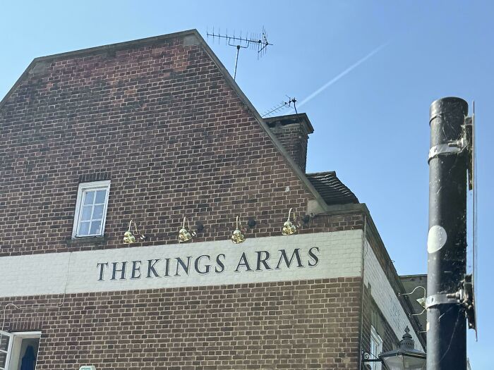
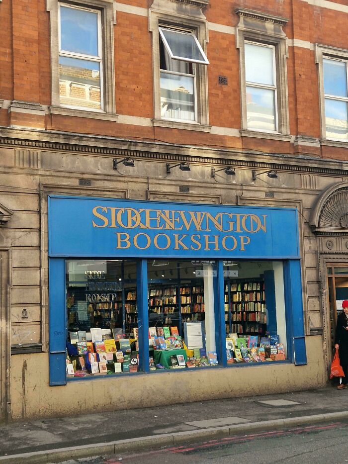
Back in the day, printers used metal blocks for each letter. Some parts stuck out, making it easier to snug up letters without them crashing into each other. It was like tiny letter Tetris.
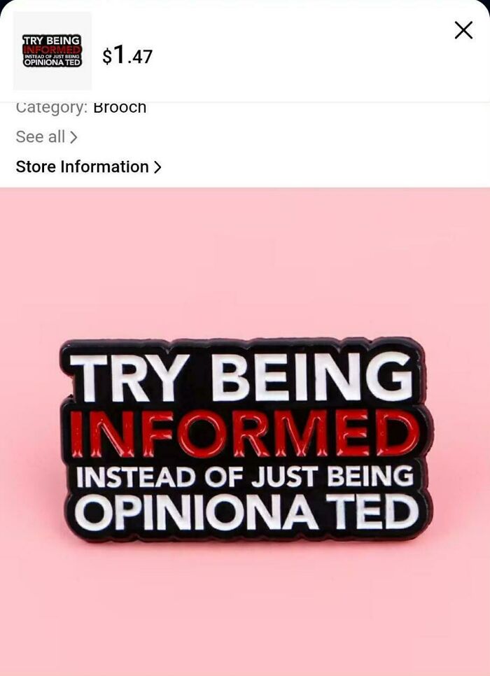
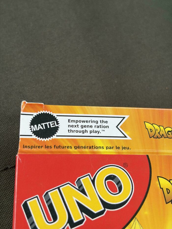
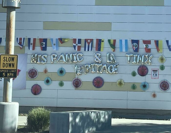
Nowadays, computers make kerning way less stressful. Fonts often come pre-packed with perfect spacing, but when they miss the mark, that’s when the fun (and fails) happen.

Here’s a fun fact: the font on a page can actually change how believable something sounds. People trusted info more when it was written in a fancy font like Baskerville. Who knew fonts had that power?
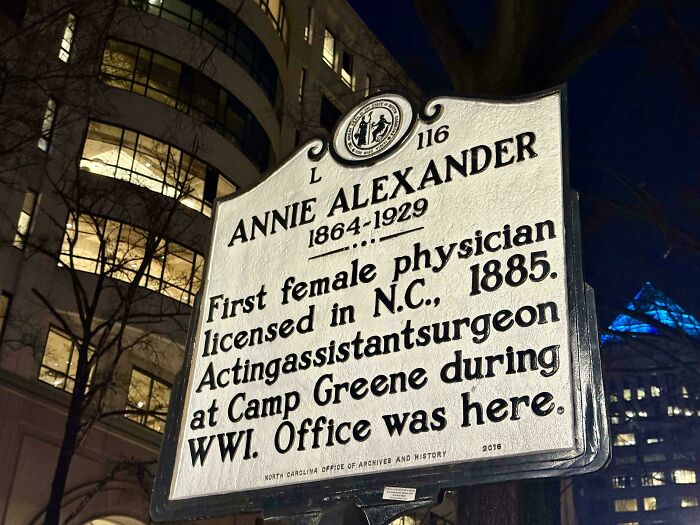
Fonts usually fall into two camps: serif fonts with little decorations on letters, and sans serif fonts which are super clean. Apparently, grown-ups don’t really pick sides and just read whatever’s put in front of them.
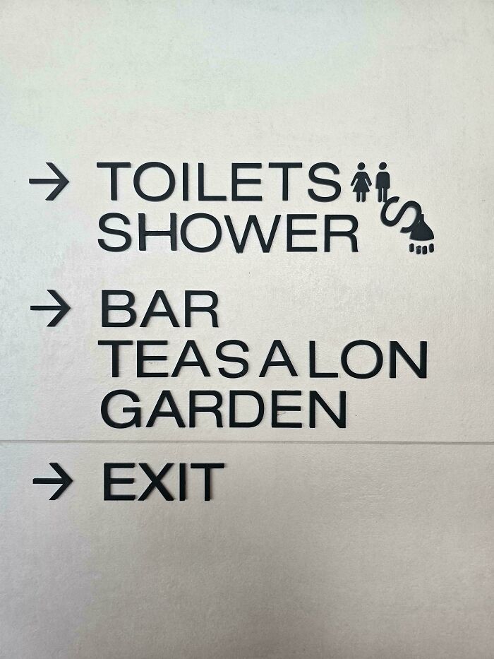
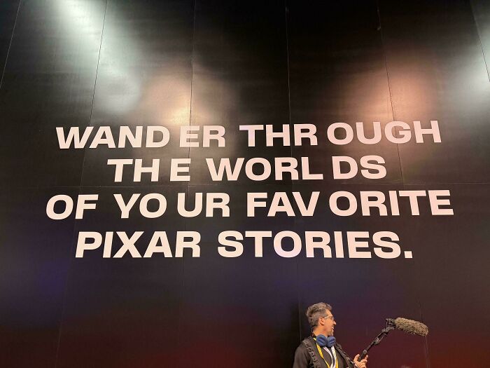
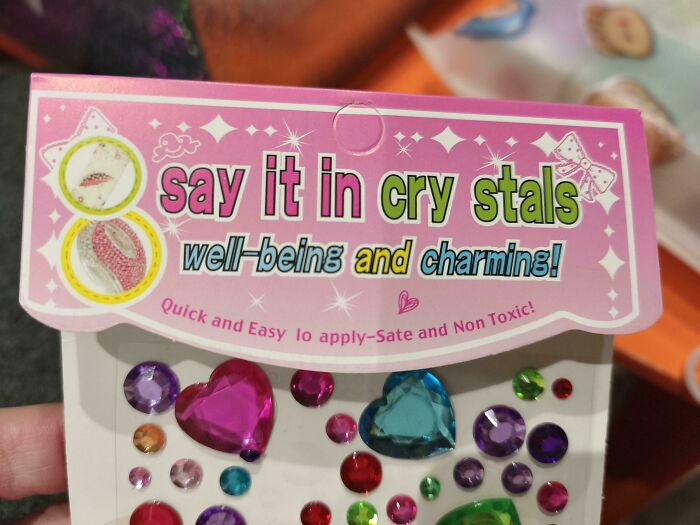
Apple’s guy Steve Jobs was super into fonts and spacing. He even took a calligraphy class and later gave Mac computers their snazzy typography charm. Thank you, Steve!
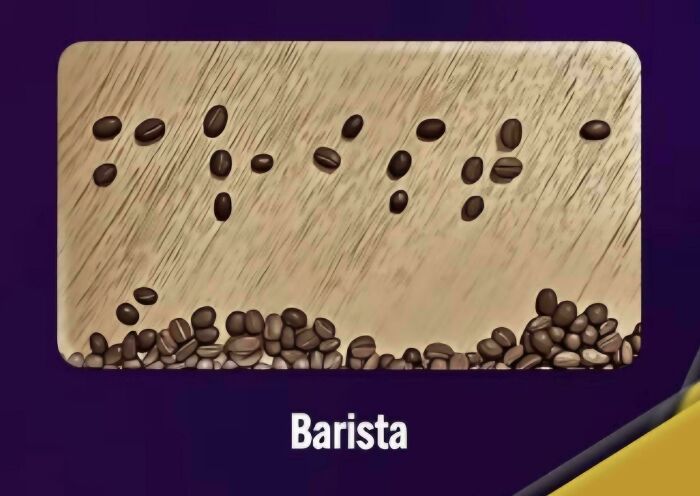
Because The B And A At The Start Of "Barista" Are Too Close, This Actually Says "Frista" In Braille
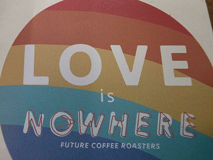
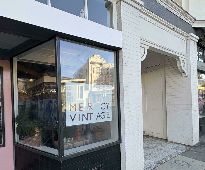
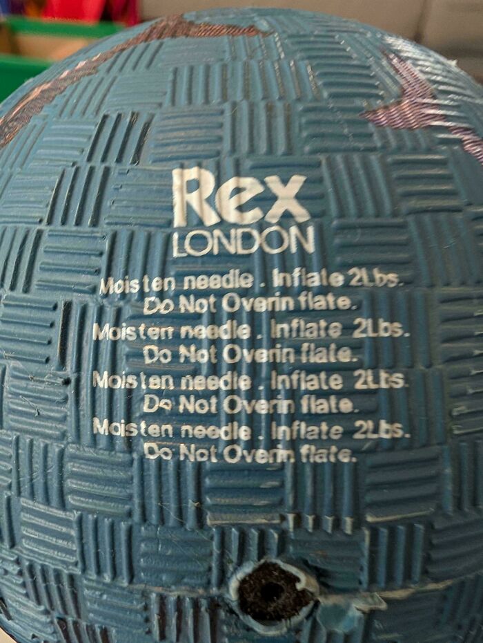
So, next time you’re glancing at a sign or your phone, remember: someone probably spent a lot of time fretting over those letters. And sometimes... they didn’t. That’s how we get these kerning disasters that are way too good not to share.



























34
0