
 then open in external browser



 and click "Open in External Browser"

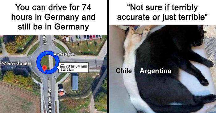
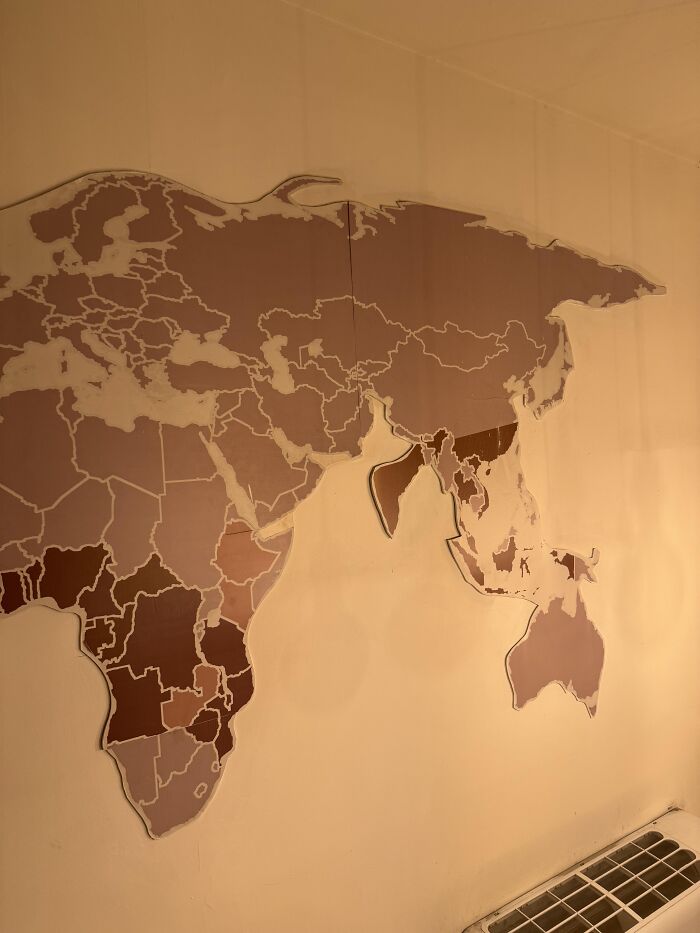
Hey there! Today, we're diving into some of the funniest, weirdest, and most confusing maps you've ever seen. Prepare to scratch your head, giggle, and question everything you thought you knew about geography. Ready? Let's go!
This post may include affiliate links.
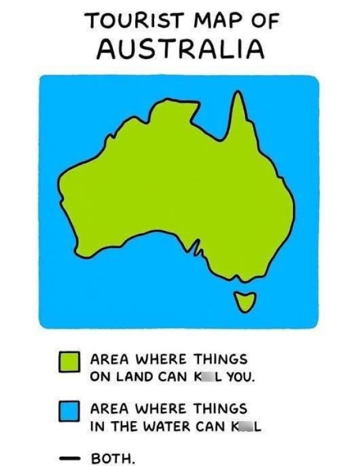

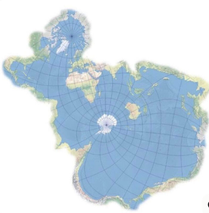
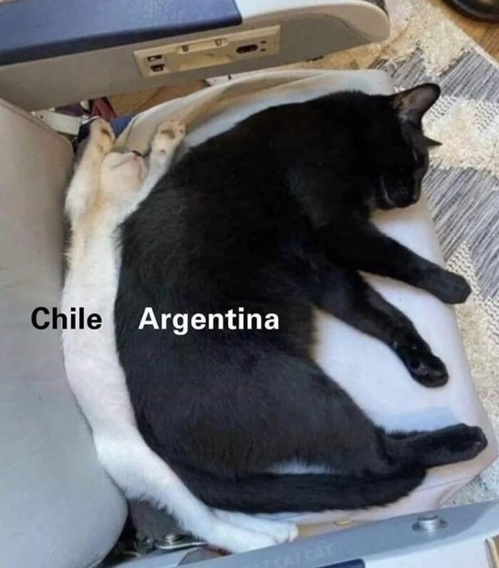
Maps are supposed to help you find your way, right? But some maps decide to do their own thing - and the results range from "Hmm... okay" to "Did someone just scribble this during a coffee break?" The best maps keep it simple and clear, while the worst ones try to be everything at once or answer questions nobody asked. Spoiler alert: The maps you're about to see mostly belong to the second category.
Take the London Underground map for example. It ditched exact distances to show connections clearly, like a subway-themed circuit board. Smart, right? But plenty of people have hopped on the "wrong" train because of how it stretches things. Even genius maps have their quirks.
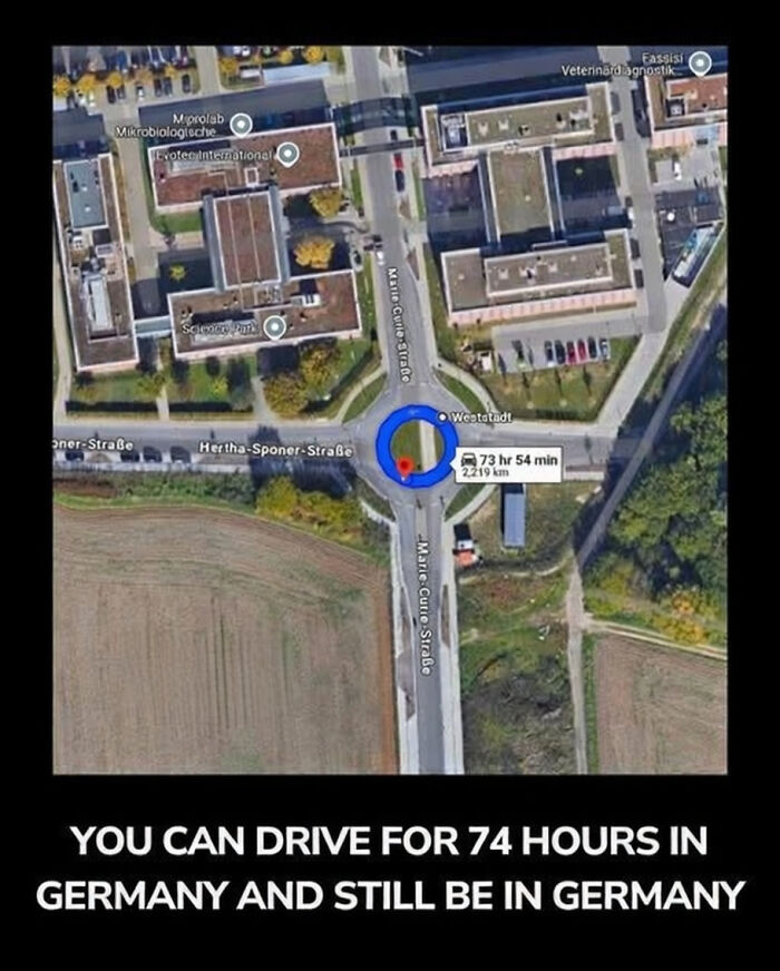
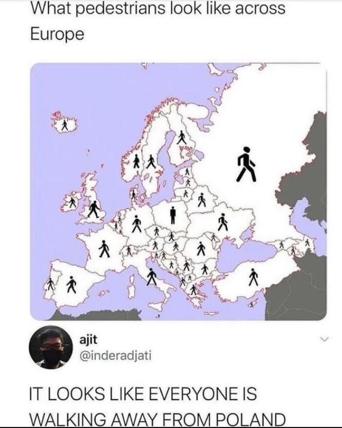
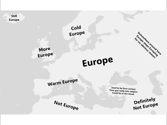
Besides clever design, a good map has little helpers like legends (those little keys that explain what the symbols mean), scales (yes, that tiny line that tells you if you’re about to sprint or trek for hours), and north arrows (so you don’t accidentally head south when you think you’re going north). Otherwise, maps turn into fancy wall art - pretty but useless.
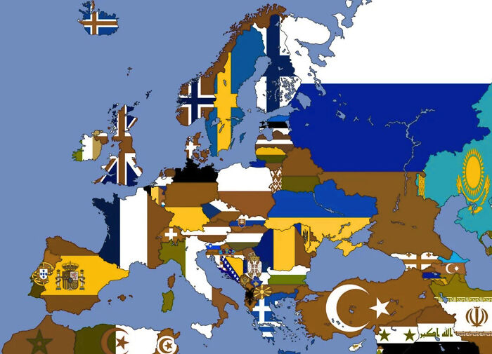
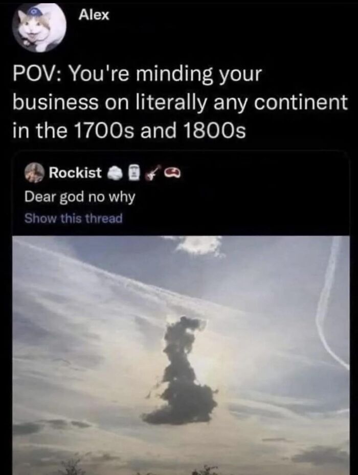
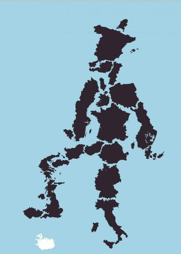
Maps also have to deal with the tricky problem of fitting a round Earth onto flat paper. Ever seen Greenland looking as big as Africa? Yeah, that's the Mercator projection playing its funny tricks. It’s great for sailors but a nightmare when trying to figure out who's actually humongous on the globe.
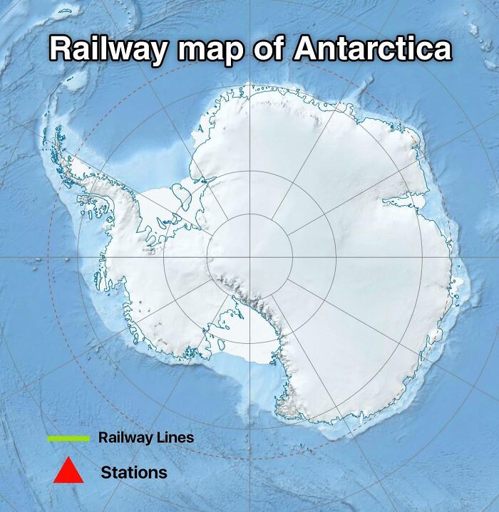
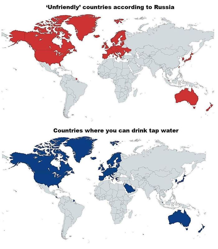
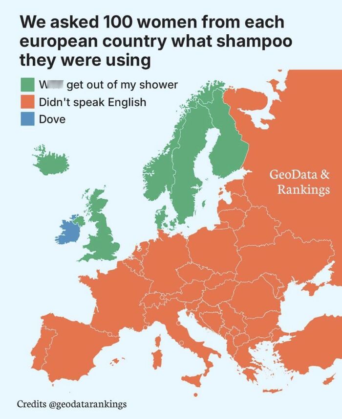
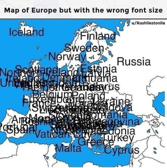
If a map throws in too many colors that blend together or squishes way too many labels until it looks like a mess, it’s basically just asking for trouble. Good maps know how to give your eyes a break. Bad maps? They expect you to have superpowers.
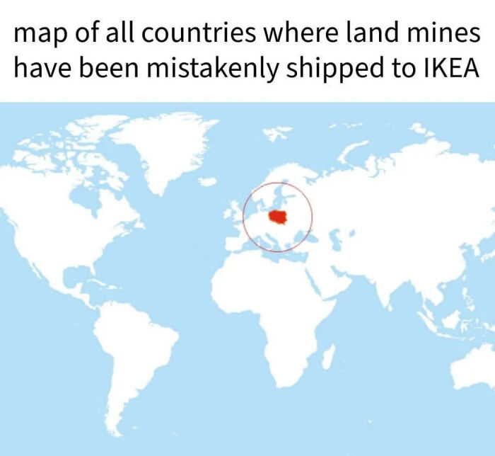
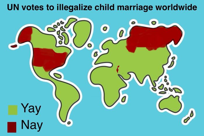
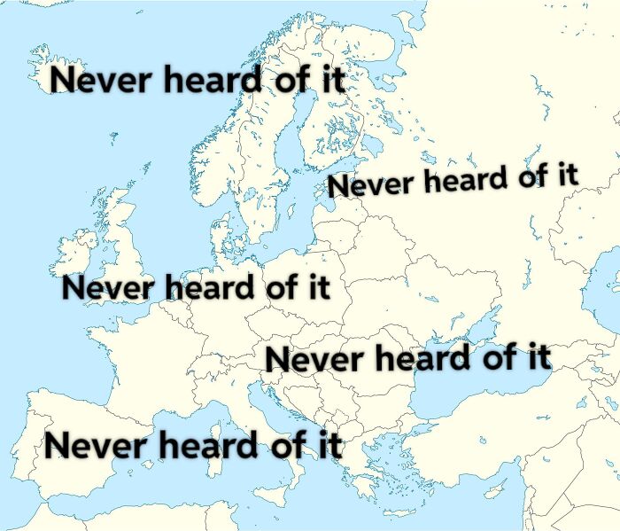
Maps can also tell stories. Like the 1854 cholera outbreak map in London that pointed right at the infected water pump. It’s like detective work, but with dots and symbols! Then there are those wild maps that cram tons of info but still make sense - like Napoleon’s messy march into Russia drawn with lines thicker or thinner based on soldier numbers. Pretty cool, huh?
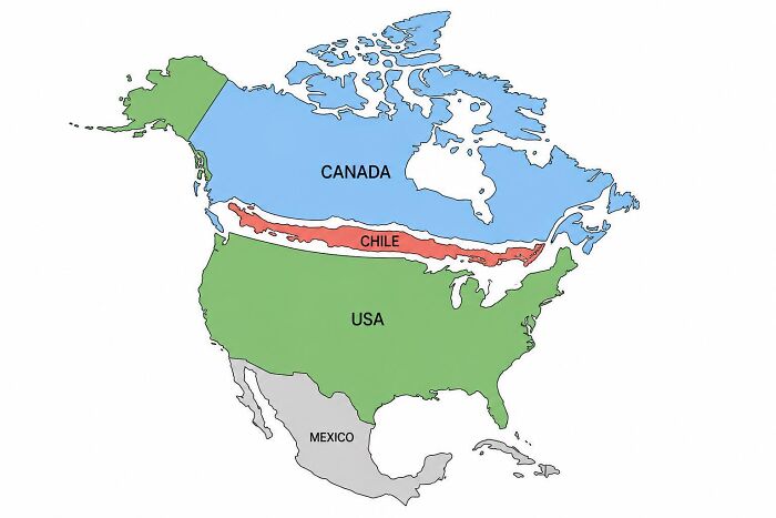
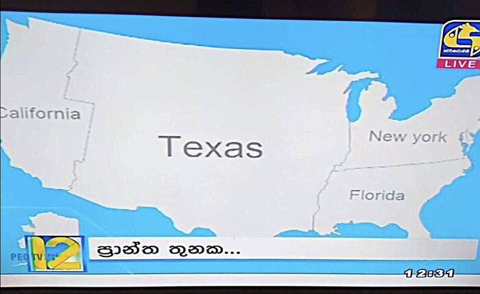
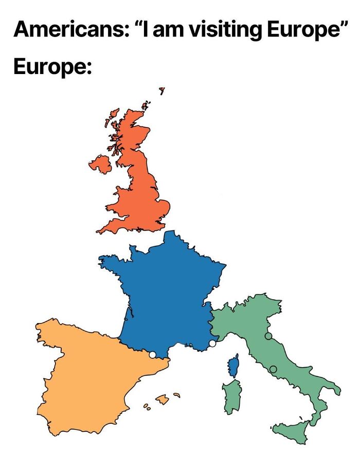
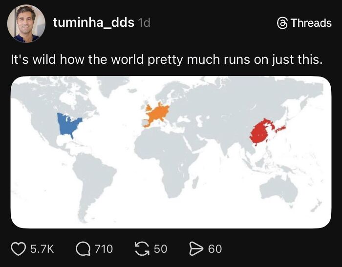
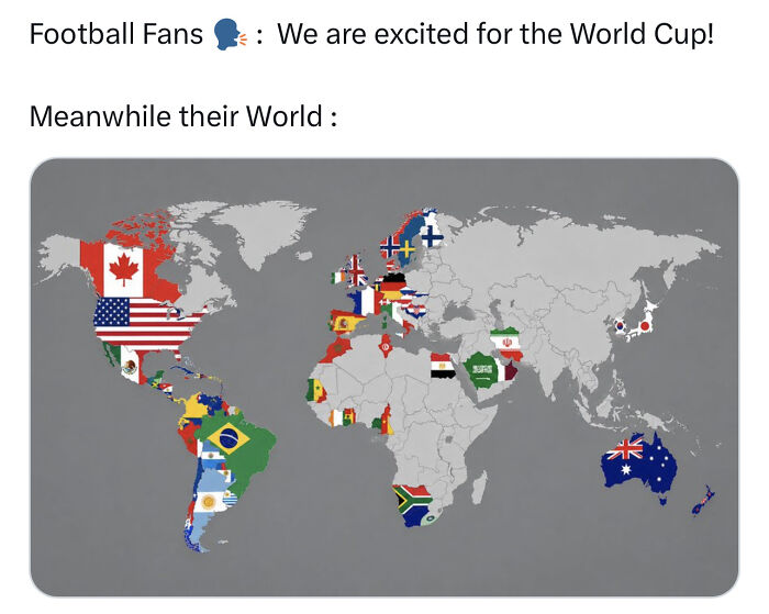
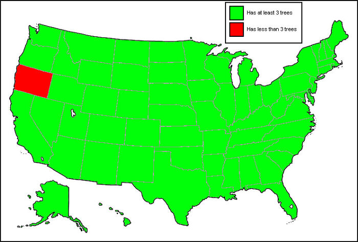
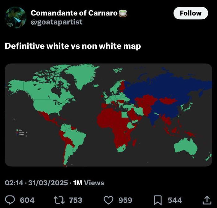
So yeah, maps can be really smart or totally bonkers. Here’s a collection of maps that mostly fall into the bonkers category. Enjoy the chaos!
























37
0